
How to Build a Product Recommendation Quiz With AI, Without a Quiz App

A product recommendation quiz is a handful of questions that ends with “this one is for you”. It helps the visitor who likes your store but cannot tell your products apart, and it gives you their answers along with their email, which is more useful than the email alone.
You do not need a quiz app to run one. This guide covers how to plan a quiz people actually finish, how to turn answers into a recommendation, when to ask for the email, and how to build it by describing it to AI. We make one of those AI builders, ProveSource Boost, so that is the one used below, but the planning part works with any tool.
When a quiz is worth building
A quiz earns its place when three things are true:
- You sell more than a handful of products that look similar from the outside: coffee blends, skincare, mattresses, running shoes, supplements.
- The right product depends on the buyer, not on taste alone. How they brew, their skin type, how they sleep.
- Your customer support already answers “which one should I get?” by asking the same few questions every time.
If you sell four products that are obviously different, a comparison table does the job faster. The quiz is for stores where the visitor needs help to choose.
Plan the questions before you build anything
The quiz is a decision tree written down. Start with the recommendation and work backwards.
List the products you would recommend. Not the whole catalog. Three to six is plenty, usually your best sellers or one product per category.
Write down how you choose between them. Imagine a customer asking in the shop. What do you ask them? Those questions are the quiz.
Cut every question that does not change the answer. “How did you hear about us?” is useful, but it is not a quiz question. If an answer would not change what you recommend, it belongs somewhere else.
Three to five questions is the range that works. Each extra question is another place for the visitor to stop.
A worked example: a coffee subscription
A roaster with three subscriptions needs three questions:
| Question | Answers |
|---|---|
| How do you make your coffee? | Espresso machine, filter or pour-over, French press, I buy decaf |
| How strong do you like it? | Light and bright, balanced, dark and bold |
| How much do you drink? | A cup a day, two or three, the whole pot |
And a simple mapping from answers to plans:
| If they answer | Recommend |
|---|---|
| Espresso machine, or dark and bold | Espresso Club |
| I buy decaf | Decaf Club |
| Anything else | Light Roast Club |
| “The whole pot” | The same club, the larger bag |
That is the whole logic. Rules like these are easier to get right than a points system, and easier for you to change later when a new product arrives.
Make the result worth reading
The result screen is where the quiz earns the sale. A good one has four parts:
- One clear recommendation. A name, a photo and the price. If you must show more than one, rank them.
- The reason, in their words. “Because you use a French press and like it bold” shows the answers mattered. Without it, the result feels random.
- A button to that product, not to your homepage.
- The email ask, framed as a reason to give it: send me this, save my result, or take 15% off the first box.
When to ask for the email
This is the decision that changes the numbers most.
Ask before the result, and every visitor who finishes gives an email. Some of those are people who wanted the answer and will never buy, and some are fake addresses typed to get past the gate. Visitors who were close to buying also leave at the gate, which is the opposite of what you wanted.
Ask after the result, and fewer people give an email, but the ones who do have a reason to: they want the result sent, or they want the discount. Those are the subscribers who open what you send.
For most stores, show the result and ask for the email beside it. If your follow-up emails are where you make the sale, test gating the result for two weeks and compare the orders, not the signups.
Build it with AI
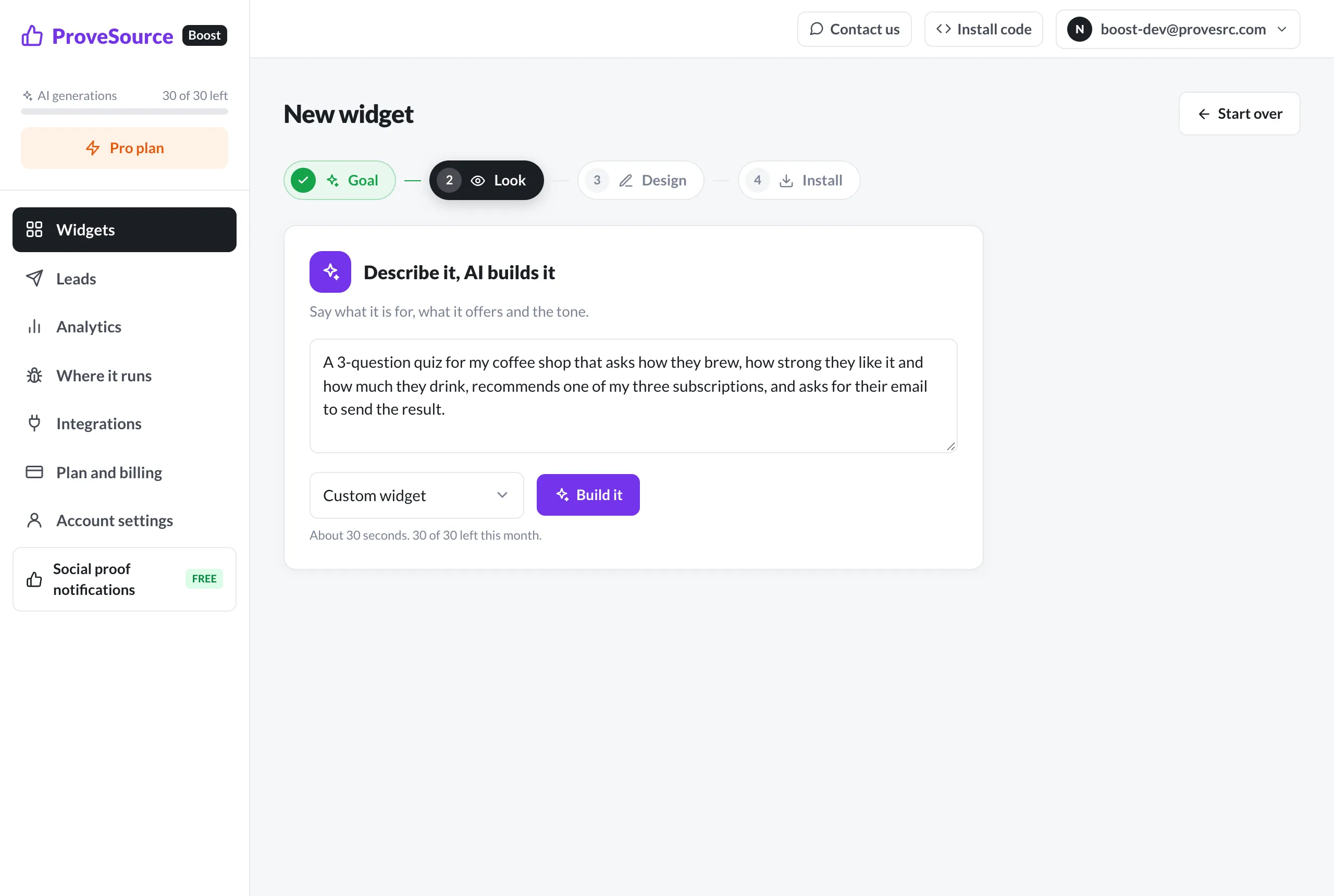
With the plan written down, the build is a description. In the AI widget builder, you write what you would tell a freelancer:
A 3-question quiz for my coffee shop that asks how they brew, how strong they like it and how much they drink, recommends one of my three subscriptions (Light Roast Club, Espresso Club, Decaf Club), and asks for their email to send the result with a 15% off first-box code.
A few things make the first draft closer to what you want:
- Use the real names of your products and plans. The AI will not guess them.
- Give the mapping if it is not obvious: “espresso or dark means Espresso Club”.
- Say where it sits: a popup, a corner card, or inside a page.
- Leave the colors out at first. The builder reads your site’s colors and fonts, and it is quicker to ask for “a darker background” after you see the draft.
From there you change it by asking (“add a fourth question about grinding at home”, “make the result show the price”), or open the HTML, CSS and JavaScript and edit it yourself. The widget runs in a sandboxed frame, so the code cannot touch the rest of your page.
Put it where people are choosing
A quiz works best at the moment of indecision:
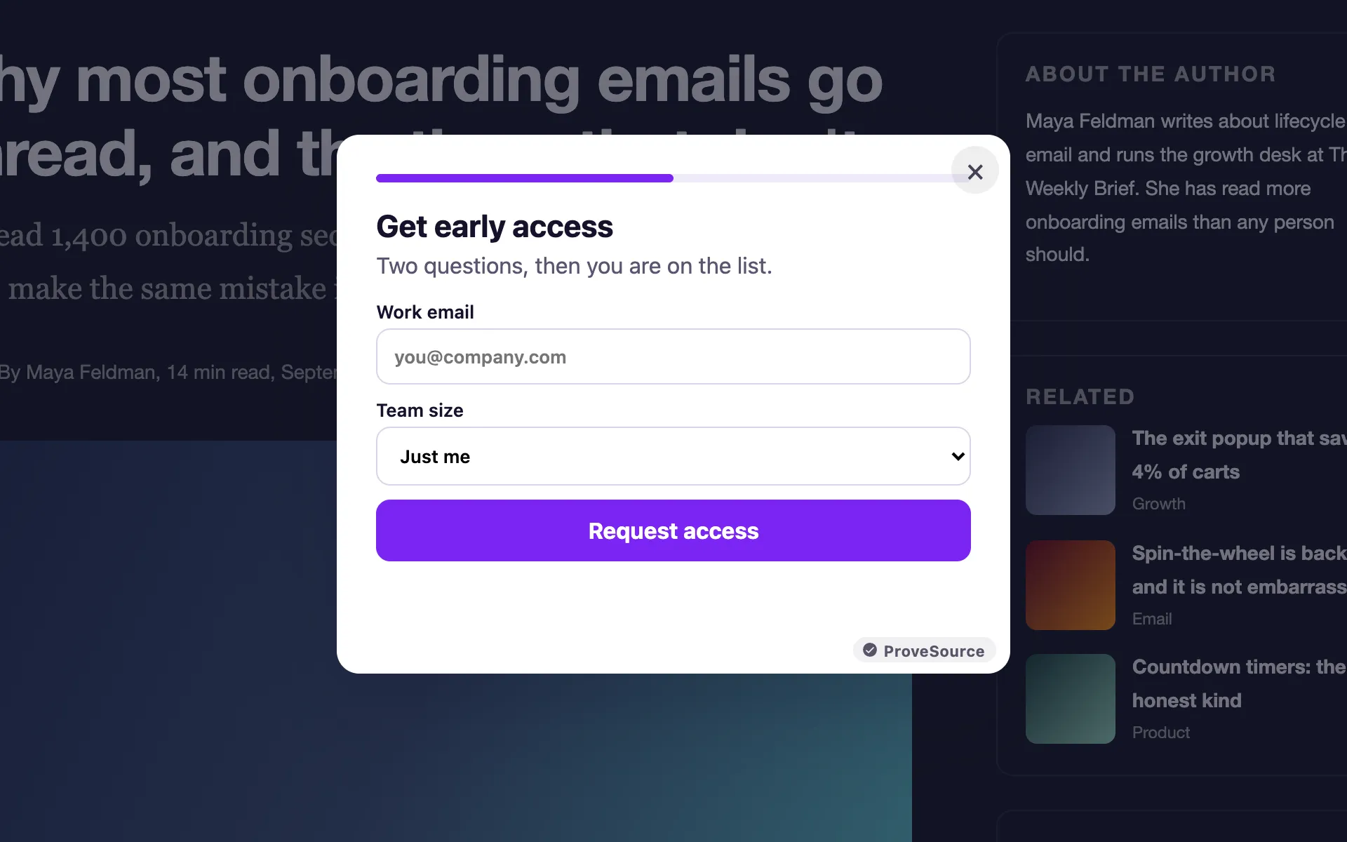
- Collection pages, as a corner card or a popup after a few seconds: “Not sure which one? Take the 30-second quiz”.
- The homepage and the main menu, as a link for visitors who arrive without a product in mind.
- Inside a page you send ads or emails to, where the quiz is the whole point of the visit.
On Shopify, WordPress, Wix and the rest, it installs the same way as any Boost widget: one line in your site’s header.
Use the answers, not just the email
Every answer comes with the lead. In ProveSource Boost the answers are saved with the email, included in the CSV export and the webhook, and sent to Klaviyo as profile properties. That means your follow-up can say “here are three more bold roasts for your French press” instead of a generic welcome.
That is where a quiz pays back. The recommendation helps someone buy today. The answers make every email after it more relevant.
How to tell if it is working
Two numbers tell you most of what you need in the first month.
Leads per view. Your dashboard shows how many people saw the quiz and how many left an email. If the rate is low, watch a few people take it. Usually one question is confusing, or the reason to leave an email is too weak.
Orders from quiz takers. Give the quiz its own discount code, one that appears nowhere else, and count how often it is used in your store’s orders report. That separates the sales the quiz made from the ones that would have happened anyway.
If people leave emails and the code is never used, look at the recommendations themselves. The quiz may be sending people to products they do not want. Change the mapping before you change the questions.
Frequently asked questions
What is a product recommendation quiz?
A short set of questions on a store’s website that ends by recommending one product, or a short list, based on the answers. Most also ask for an email so the store can send the result and follow up.
How many questions should a product quiz have?
Three to five. Each question should change the recommendation. If an answer would not change what you recommend, cut the question.
Should the quiz ask for the email before or after the result?
Show the result first and ask for the email to send it, save it or unlock a discount. Hiding the result behind the email gets more emails from people who were never going to buy, and loses the people who were.
Do I need a Shopify quiz app?
No. A quiz is a small widget. You can describe one to an AI widget builder and paste one line of code into your theme, and the answers go to your email tool like any other signup.
Where should the quiz go on my site?
As a popup or a corner card on collection pages, where visitors are comparing, and as a link from the homepage and the main menu for people who arrive unsure what to buy.