23 Pop-Up Examples, With the Trigger, Timing and Offer Behind Each

In this article
Most pop-up example lists are screenshots. You see the design and none of the decisions behind it: when it opened, who saw it, how often, and what the visitor got for their email. Those decisions matter more than the colors.
So every example below comes with its settings. They are all ProveSource Boost templates, shown on two demo sites, a clothing store and a blog, and you can open any of them in the free builder and change the words. At the end there is a table with every trigger in one place.
What separates a pop-up that works from one that annoys
Three settings decide most of the result.
The trigger. A pop-up that opens as the page loads asks for an email before the visitor knows what you sell. Five to fifteen seconds, half the page scrolled, or the moment they move to leave all work better, because by then the visitor has decided whether they are interested.
The frequency. Someone who closed your pop-up does not want it on the next page. Once a week is a sensible default, and nobody who already signed up should ever see it again.
The offer. “Subscribe to our newsletter” is not an offer. “10% off your first order”, “the checklist version of this article” and “free shipping over $50” are. The more specific the thing, the more people take it.
Design comes fourth. The examples look good, but the settings are what you should copy.
Email signup pop-ups
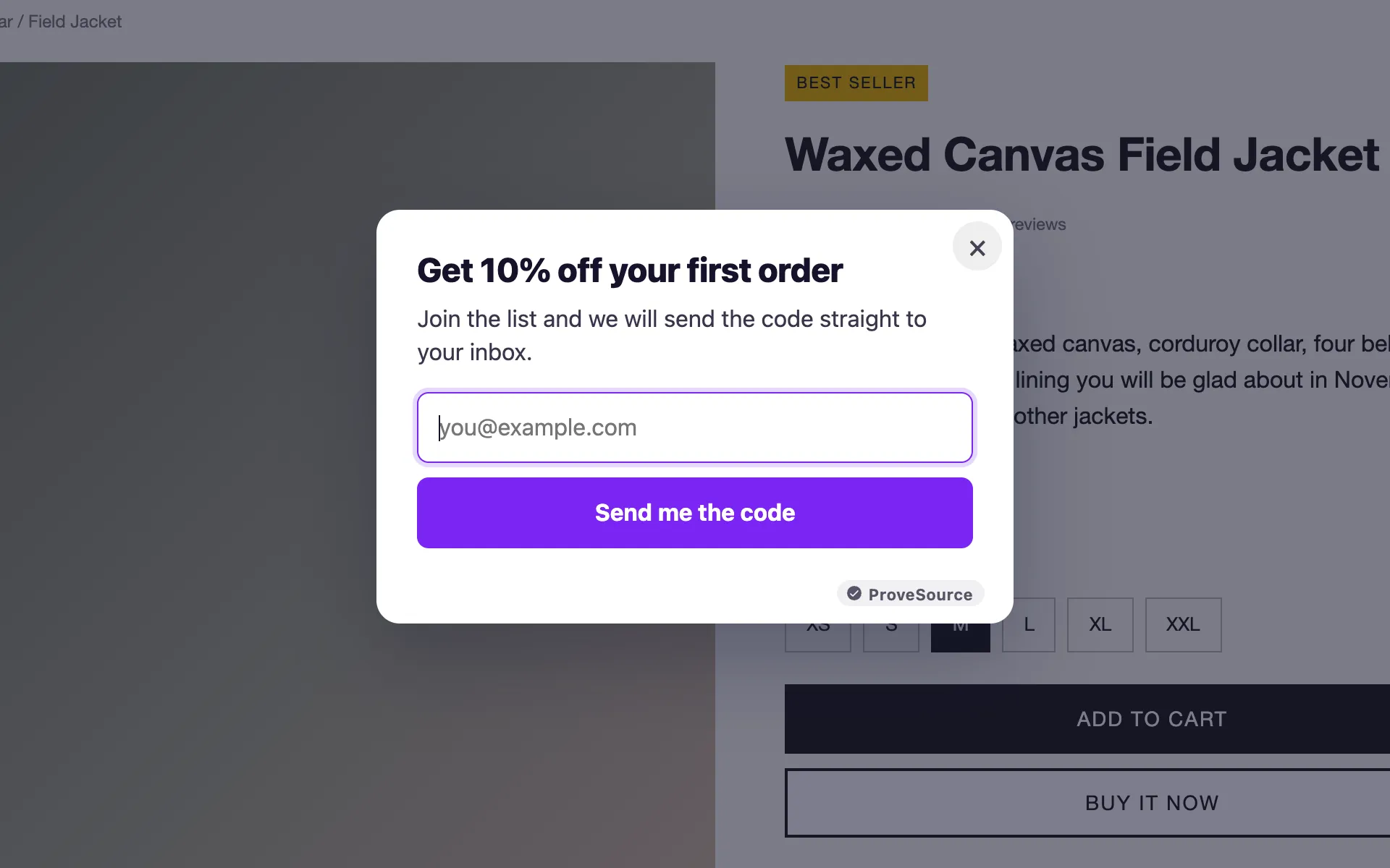
1. The first-order discount
The most common e-commerce pop-up, and the reason is simple: a new visitor gets a reason to buy now and you get an email either way. The code shows on screen after signup.
It opens after about 10 seconds on product pages, for new visitors only. Returning customers already know you and do not need the discount.
2. The newsletter that says what you get
“One email a week, worth opening” beats “Subscribe”. It tells the reader how often and what kind, which answers the two questions that stop most people from signing up.
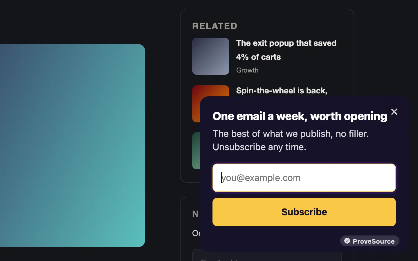
On a blog, show it after the reader has scrolled halfway down an article. Someone who read half a post is far more likely to open what you send than someone who landed and left.
3. The lead magnet
A free guide, template or checklist, delivered by email. Asking for a name as well is fine here, because the visitor expects a PDF with their name on the email.
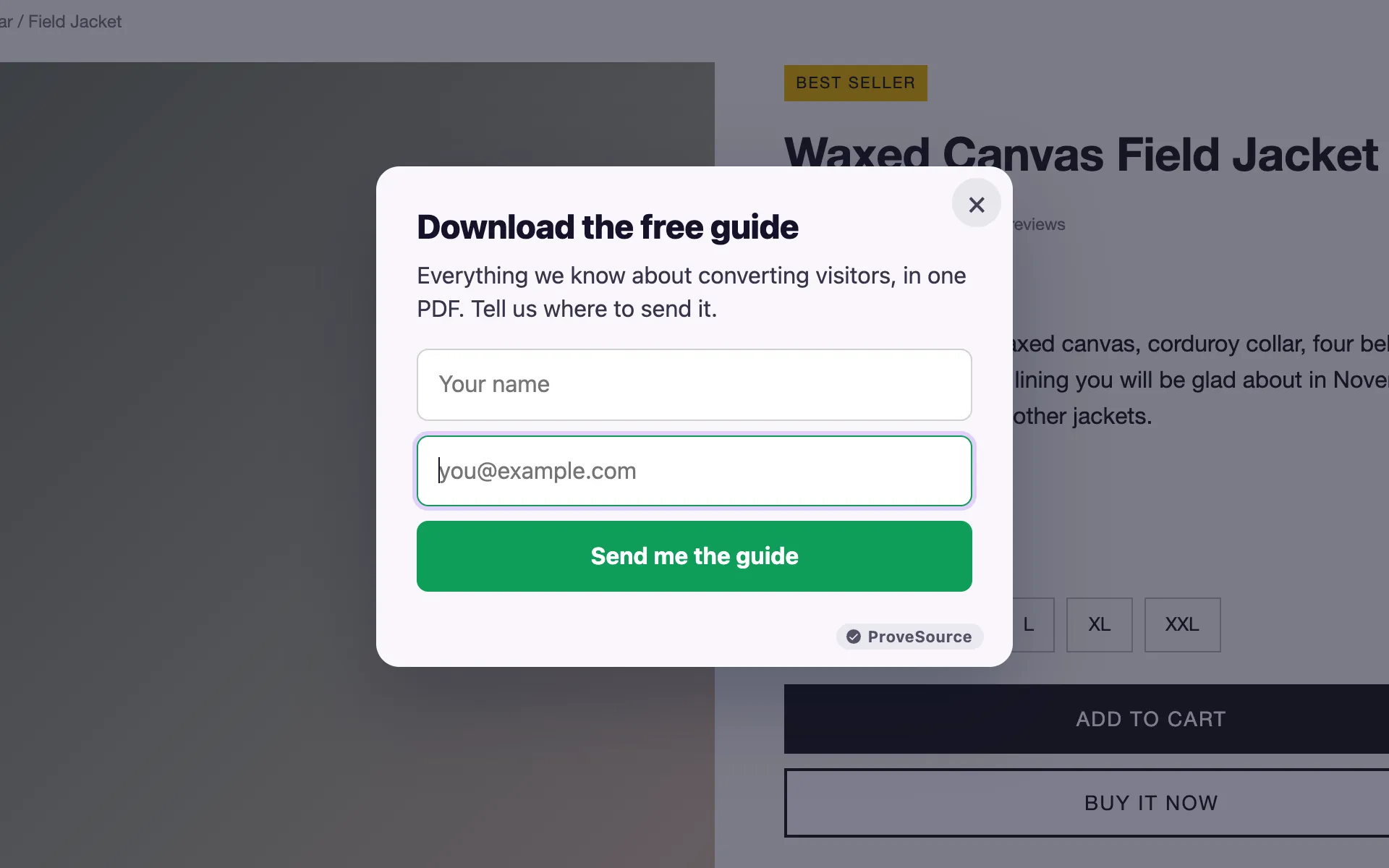
Match the guide to the page. A general “download our ebook” asks the reader to care about something new. A guide about the thing the article covers is what they were already reading about.
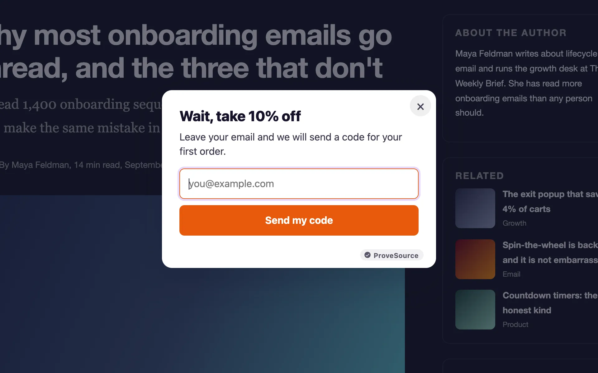
4. The exit-intent offer
“Wait, take 10% off”, shown only when the cursor leaves the window. It reaches people who were leaving anyway, which is why it annoys less than a pop-up that interrupts reading. We wrote a full guide on how exit-intent pop-ups work, including what happens on mobile.
Urgency pop-ups
5. The flash sale with a countdown
A 24-hour sale is a real deadline, so a live countdown is honest here. The timer turns “I’ll come back later” into “I’ll decide now”.
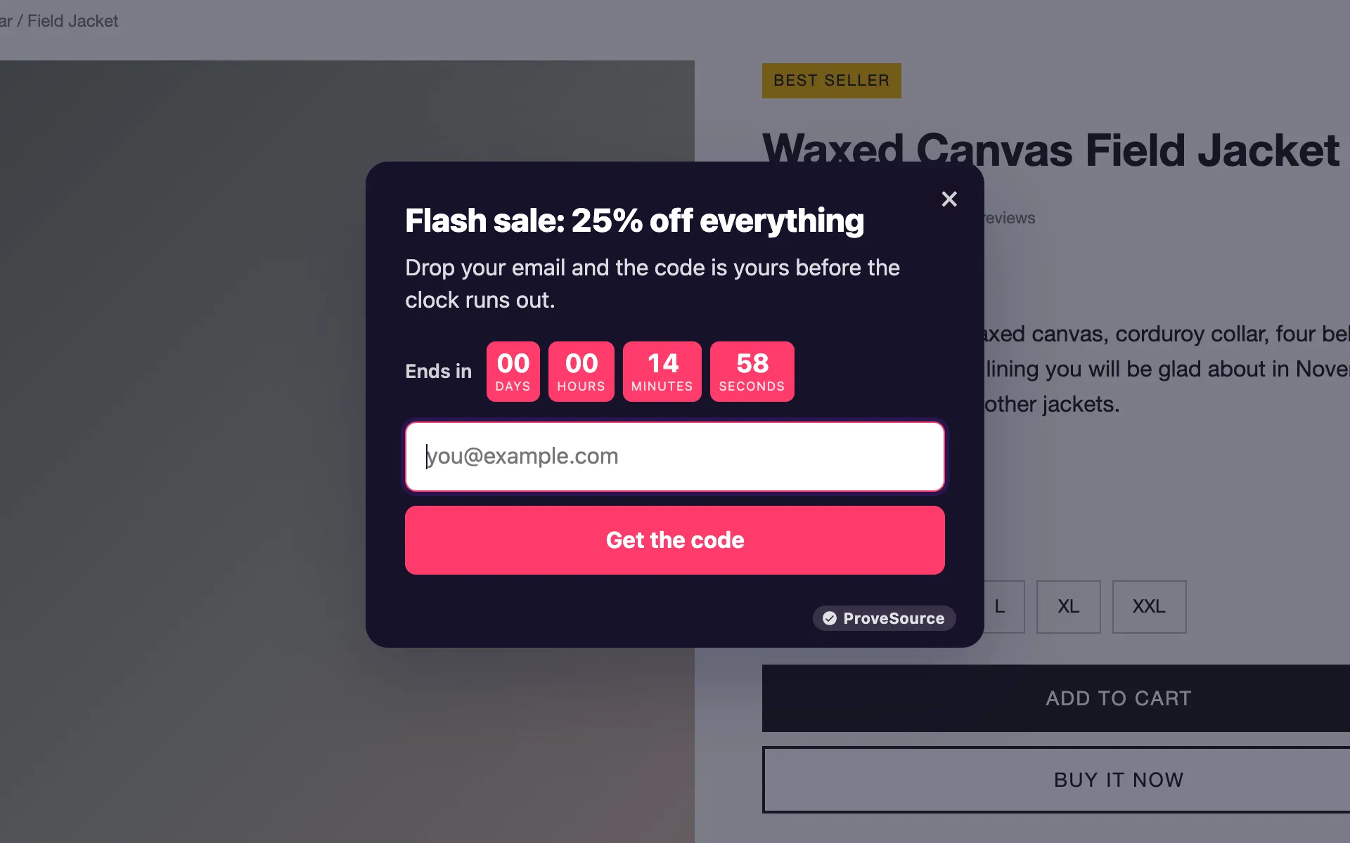
Only use a countdown when the deadline is real. A timer that resets on every visit is easy to spot, and visitors who spot it stop trusting your other claims too.
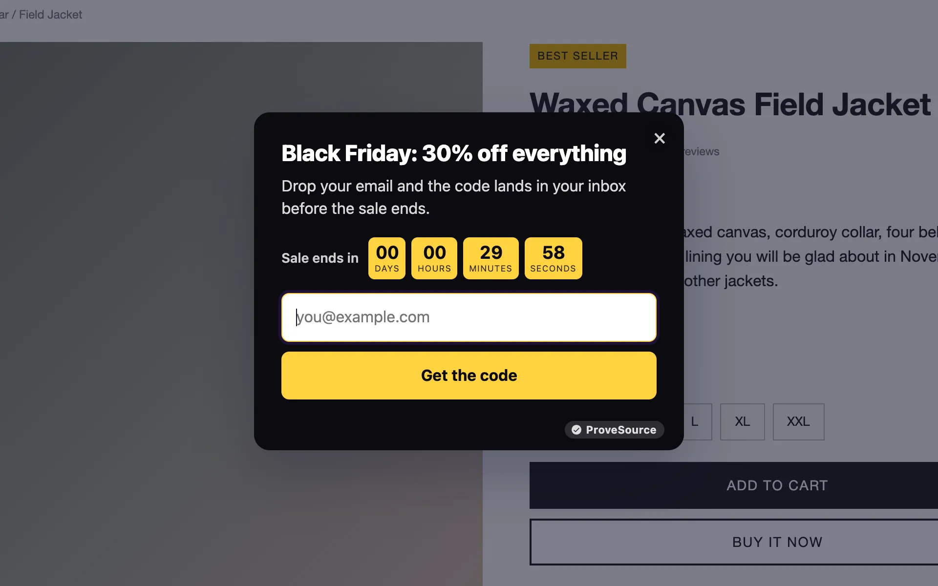
6. The Black Friday pop-up
The same idea on the biggest weekend of the year: the discount, the end time and the code in exchange for an email. Schedule it ahead so it starts and stops on its own. There is a whole Black Friday kit with matching bars and timers.
Gamified pop-ups
A game makes giving an email feel like the price of playing rather than a form. They fit stores that run frequent promotions and a playful brand. For B2B, skip them.
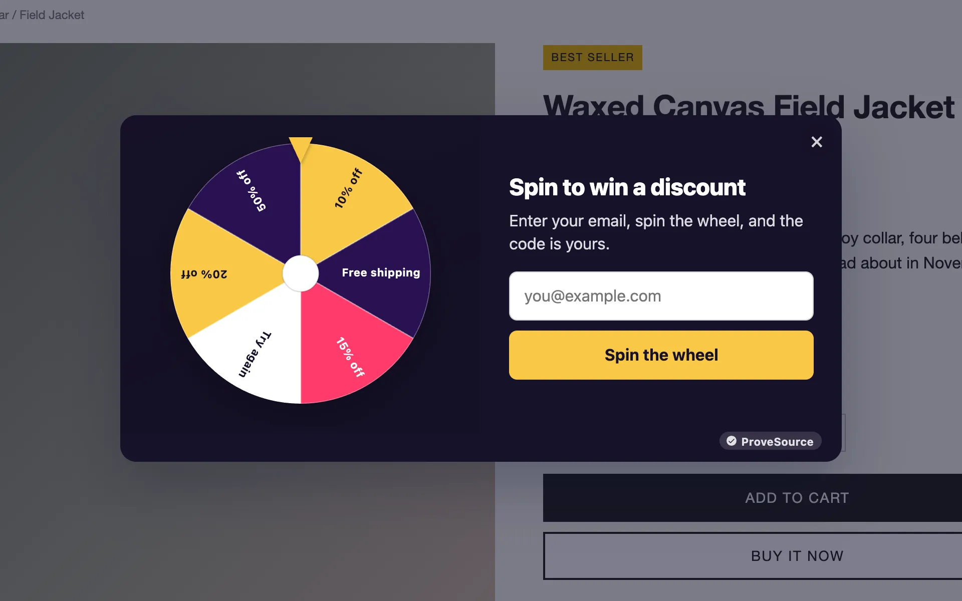
7. Spin to win, dark theme
The classic prize wheel. The visitor enters their email, spins, and wins one of the prizes you set, with the odds you set.
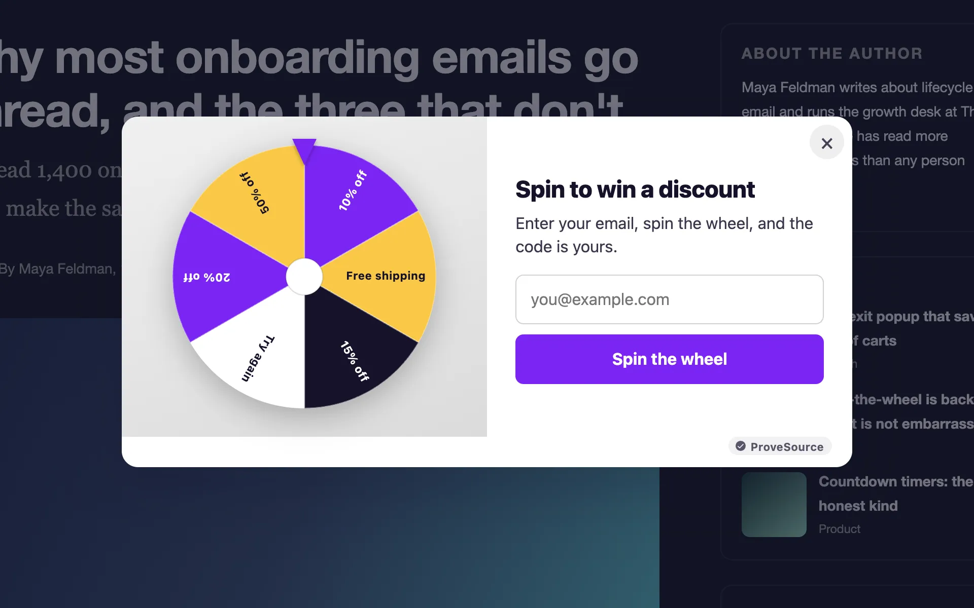
8. Spin to win, light theme
The same wheel on a blog. Keep the prizes small and frequent: a wheel where most spins win 10% feels generous, a wheel where most spins lose feels rigged.
9. The result screen
What the visitor sees after the spin matters as much as the wheel. Show the prize, the code with a copy button, and where to use it.
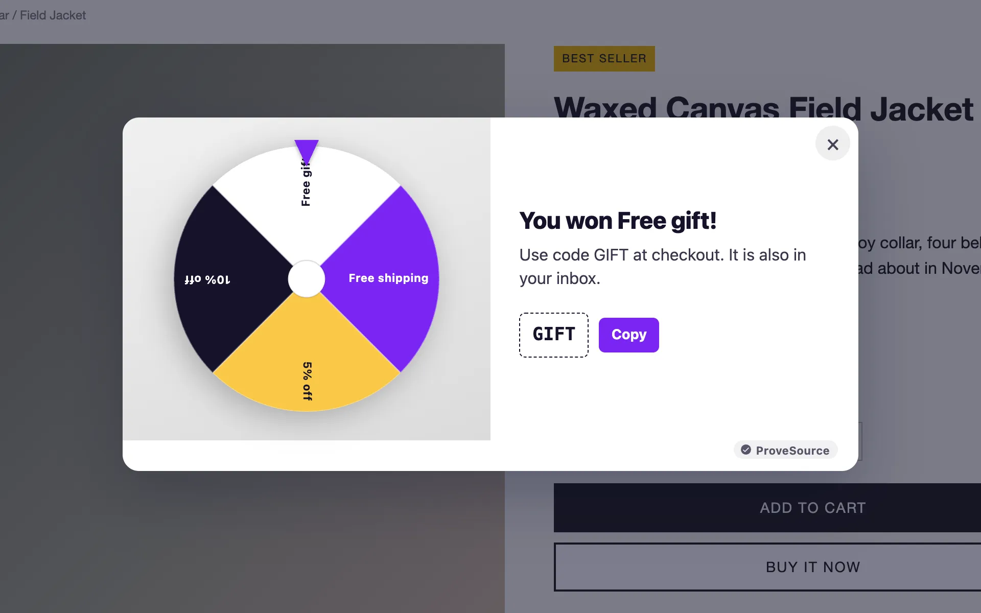
More on odds and prize tables on the spin the wheel pop-up page.
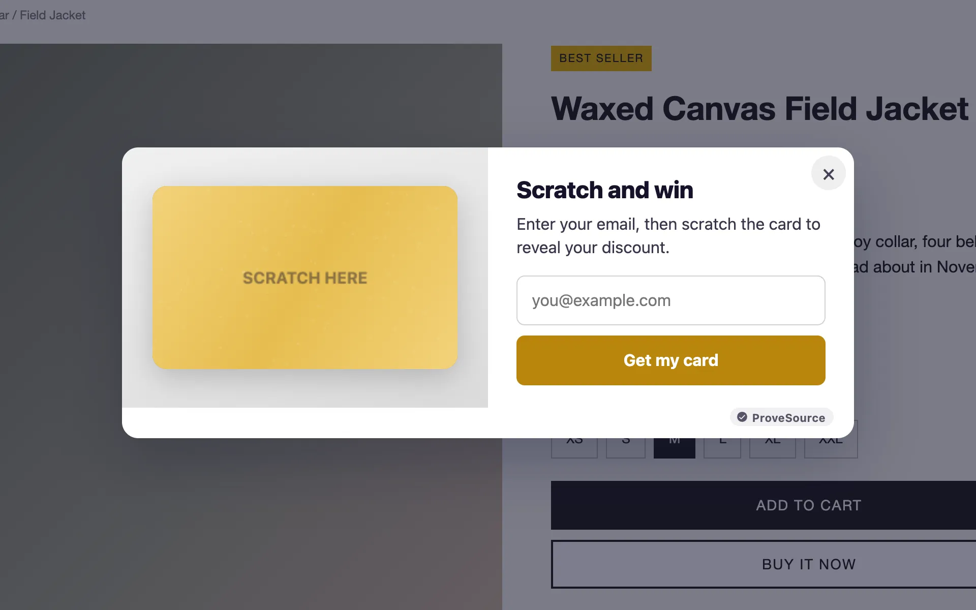
10. The scratch card
A calmer alternative to the wheel: one card, one reveal. It suits brands where a spinning wheel feels too loud.
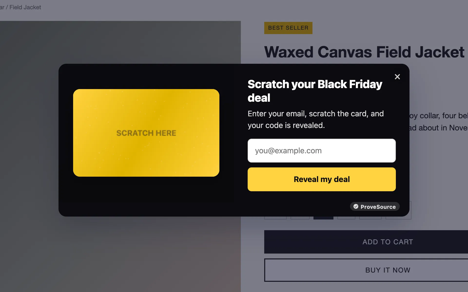
11. The Black Friday scratch card
The scratch card in sale colors, with the prize revealed as the deal of the day.
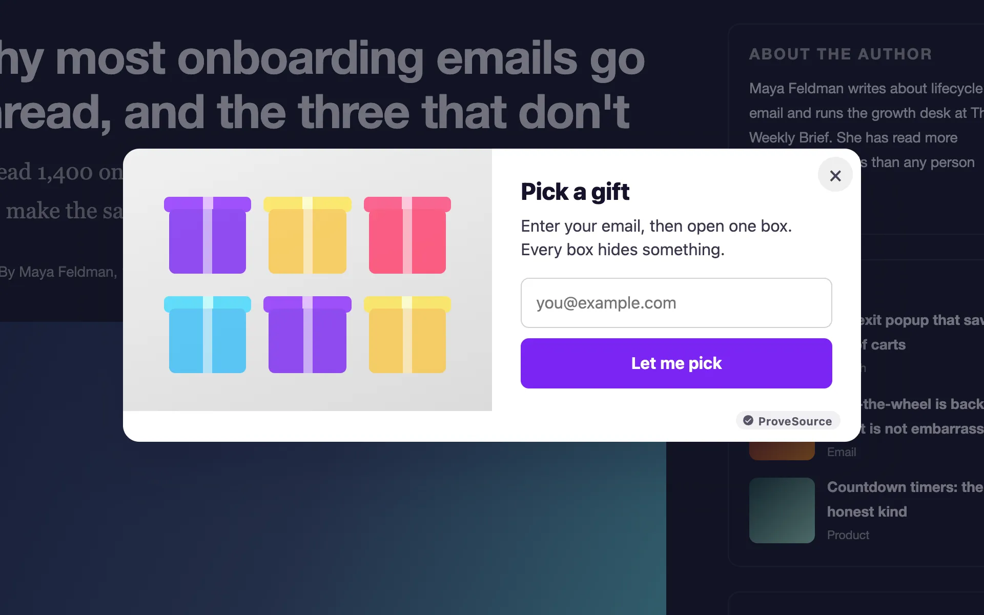
12. Pick a gift
Six boxes, one pick. Every box hides something, so it feels like a choice rather than luck.
Announcement bars
A bar across the top of the page is the least intrusive widget there is. It never covers the content, which makes it the safe choice on mobile.
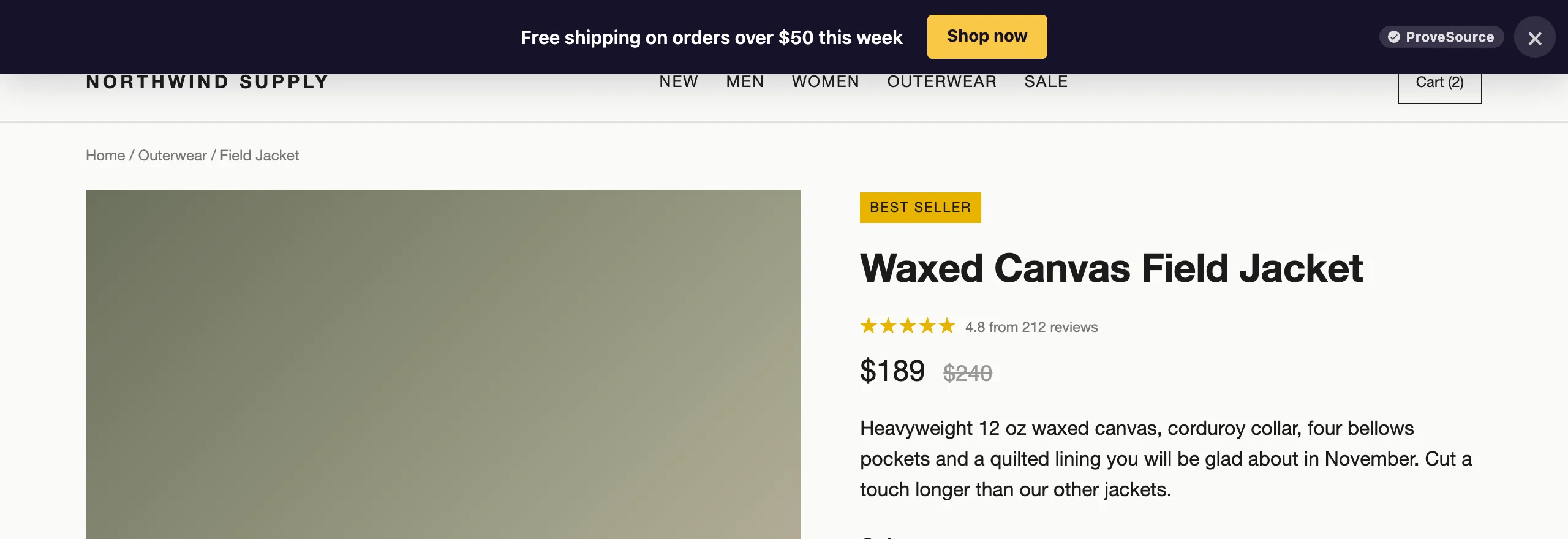
13. Free shipping threshold
“Free shipping on orders over $50 this week”. Extra costs are the most common reason shoppers abandon a cart, at 40% of abandonments in Baymard Institute’s research, so saying it up front answers the objection before checkout.
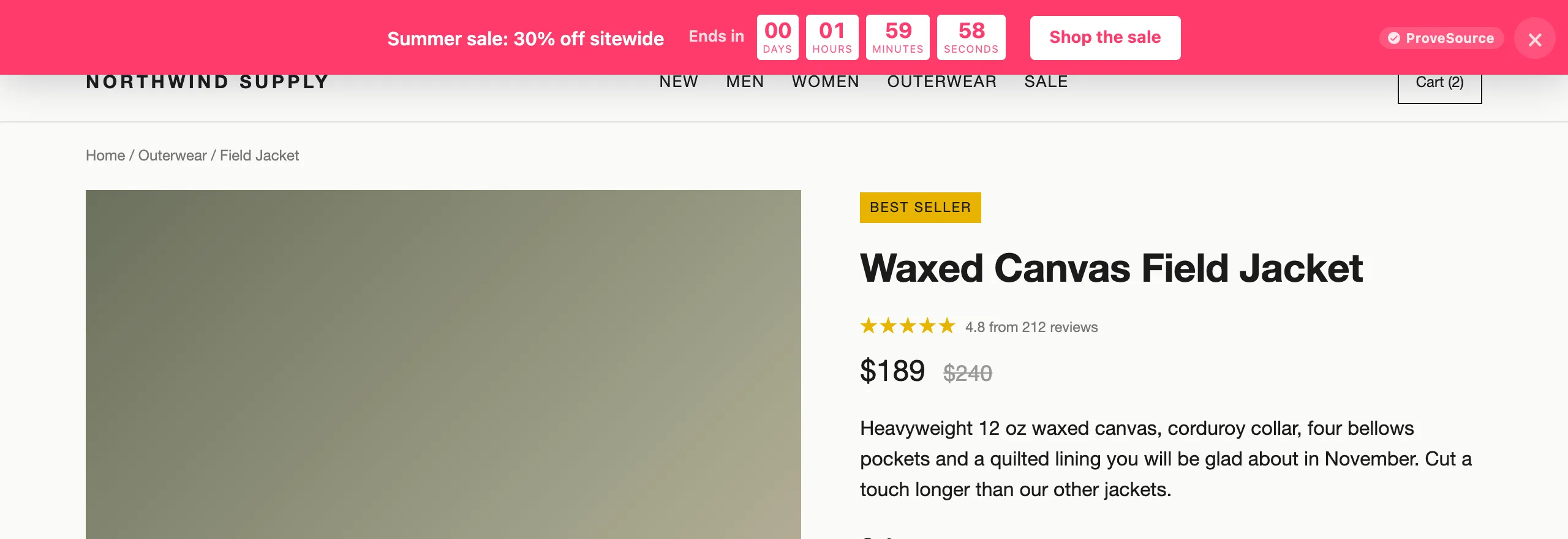
14. The sale bar with a countdown
The sale, the end time ticking down and a button to the sale page, on every page of the store.
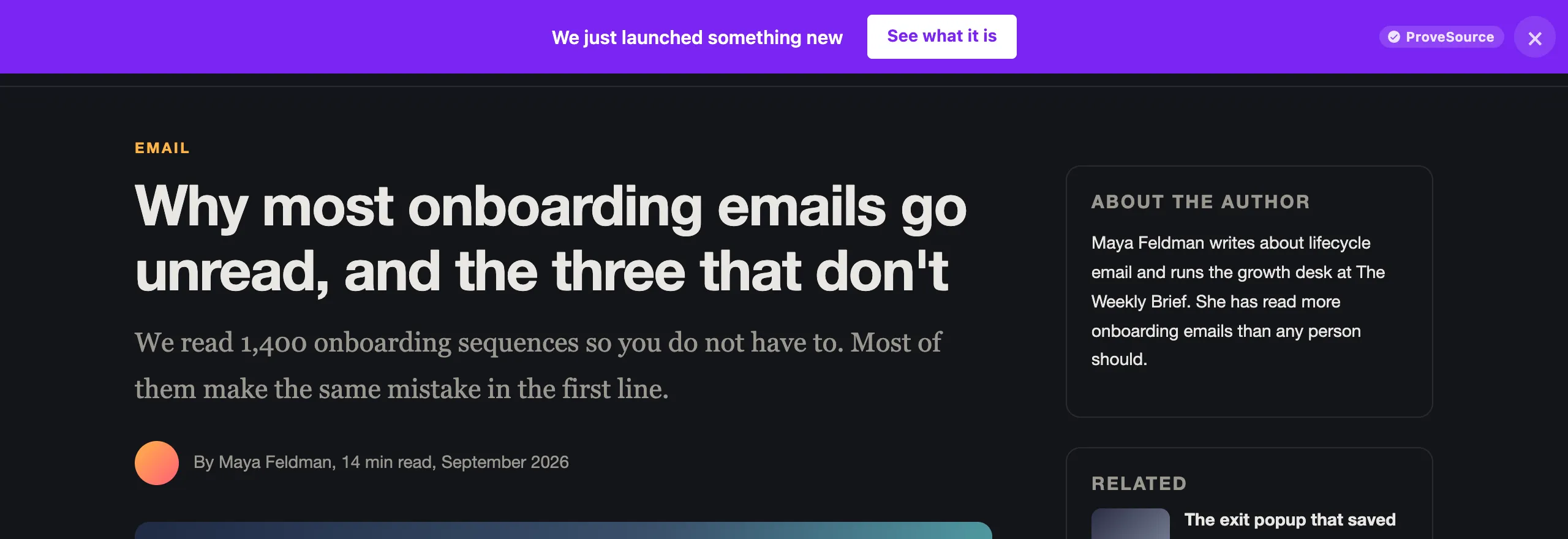
15. The launch bar
“We just launched something new” with one link. On a blog or a SaaS site this is often all the promotion a launch needs.
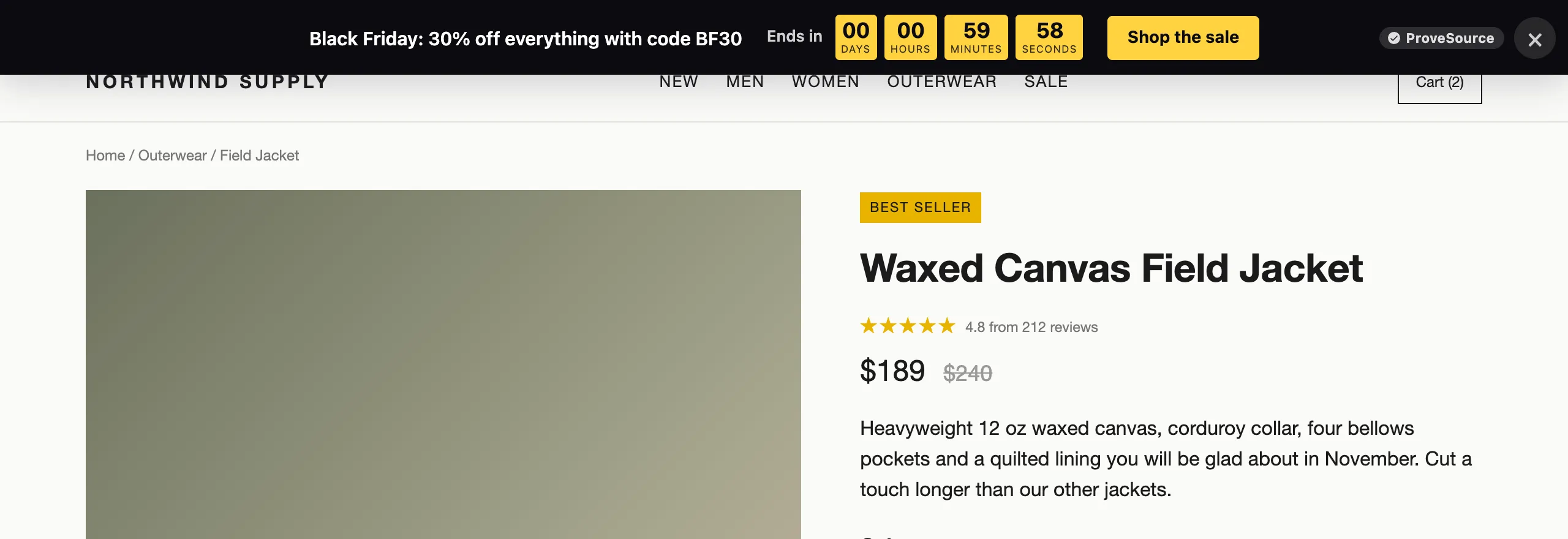
16. The Black Friday bar
The code in the bar itself, so shoppers do not have to hunt for it at checkout.
More templates on the free announcement bar page.
Countdown timers inside the page
Not every urgency message needs a pop-up. A timer next to the price is seen by everyone who reads the product page and interrupts no one.
17. The boxed countdown
Days, hours, minutes and seconds in colored boxes, right under the price.
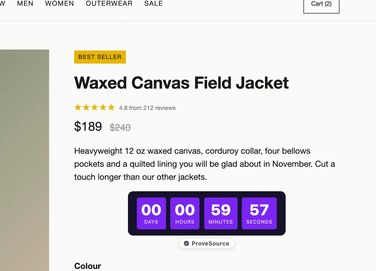
18. The flip clock
The same deadline in a flip-clock style that suits darker, premium stores.
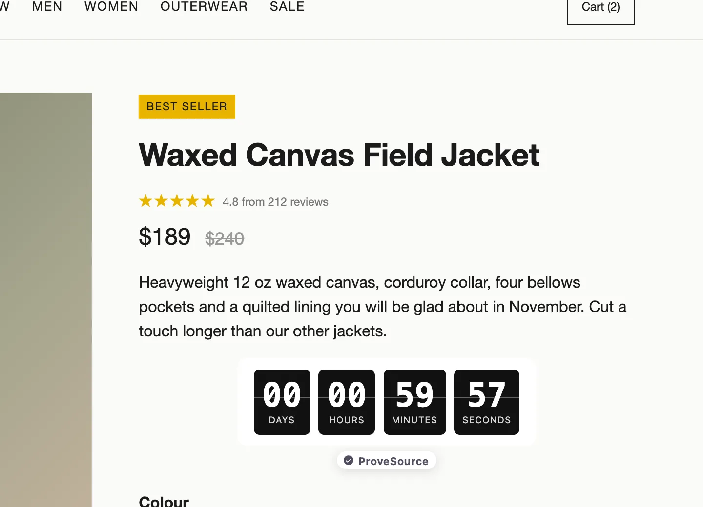
Both can count to a fixed date or run a set time from each visitor’s first view. See the styles on the countdown timer page.
Chat and call buttons
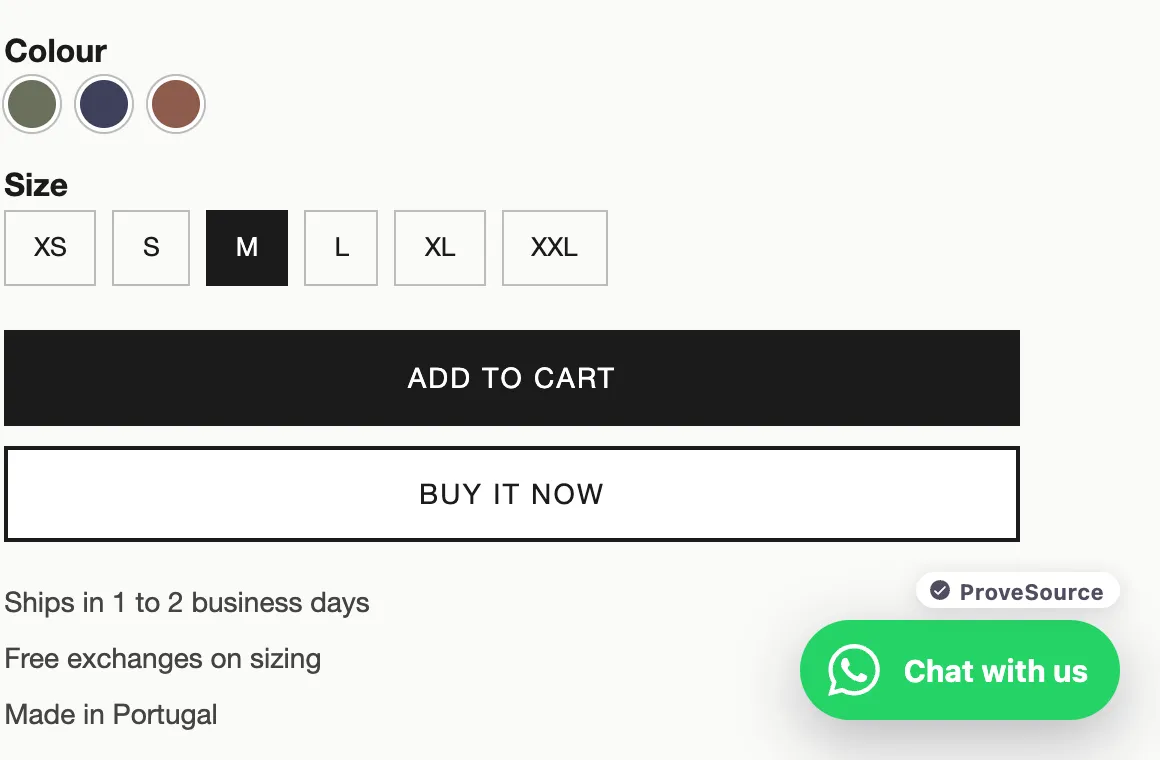
19. WhatsApp chat
A floating button that opens a WhatsApp chat with your number and a message already typed. For stores where people have questions about sizing or delivery, it catches the visitor who would otherwise leave to ask a competitor.
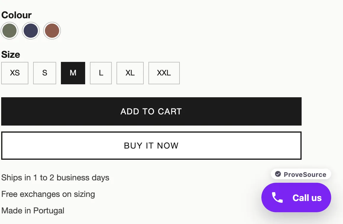
20. Click to call
The same button, set to open the phone dialer. It fits local services and anyone who sells over the phone.
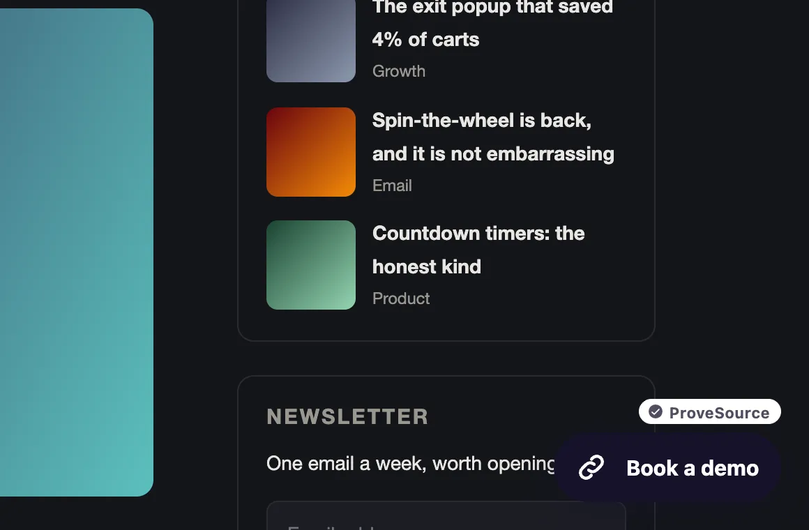
21. Book a demo
Point the button at any link: a booking page, a contact form, a demo calendar.
See the styles on the WhatsApp button page.
Custom and combined
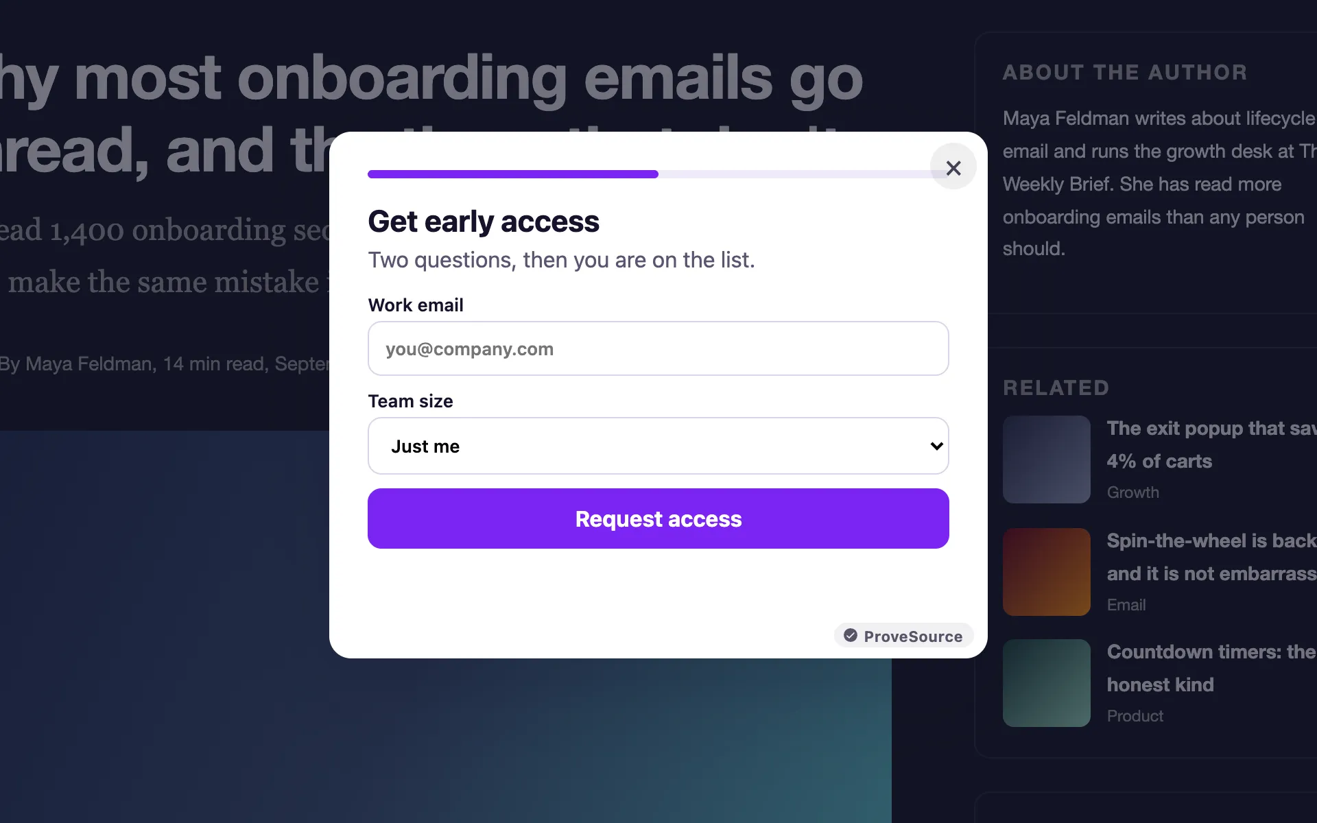
22. The two-step signup
A progress bar, a work email, then one question about team size. Asking one easy question on the way to “Request access” makes the form feel shorter than it is, and the answer tells you which leads to call first. This one is a custom widget. With the AI widget builder you can describe one like it in a sentence.
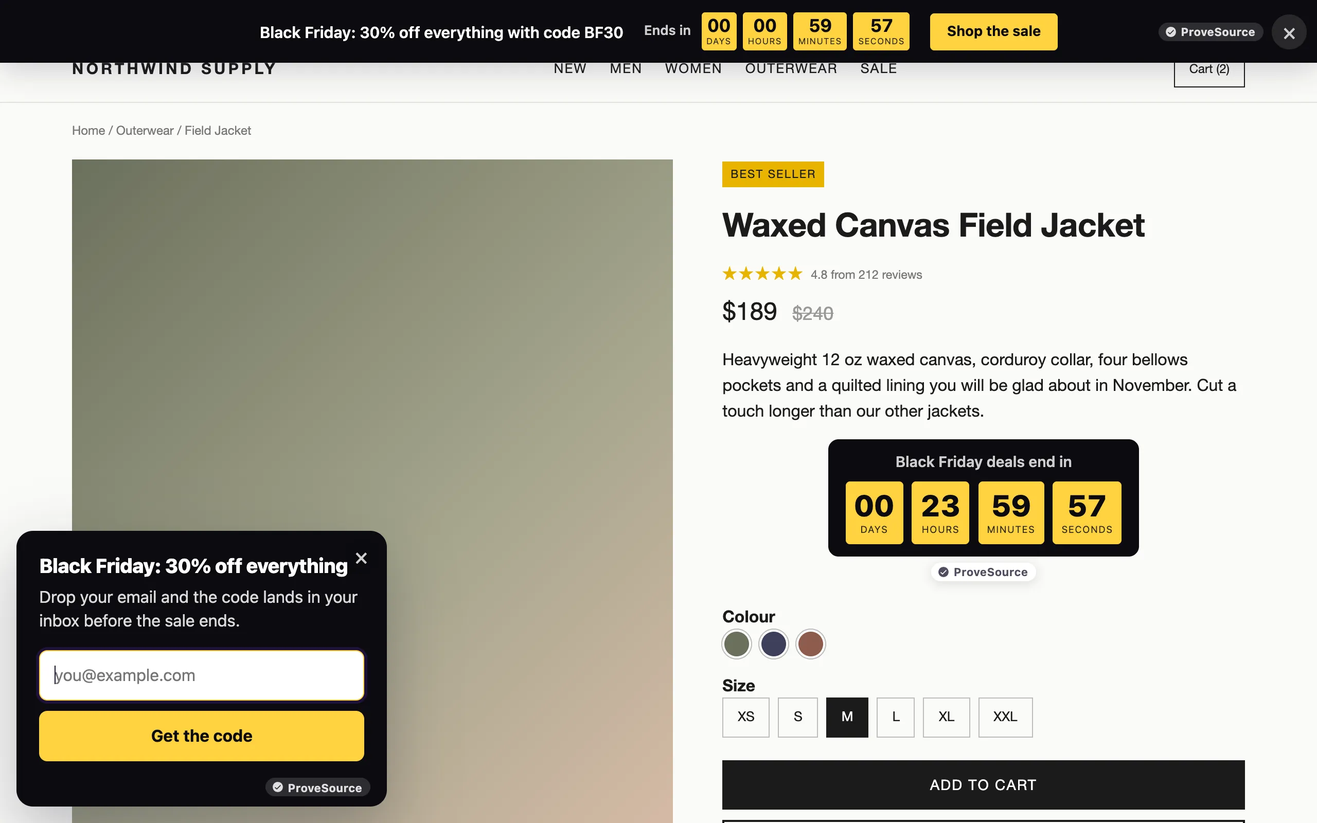
23. The whole store on sale
A bar at the top, a countdown by the price and a small offer card in the corner, all saying the same thing. Three widgets that agree with each other are more convincing than one large pop-up that shouts.
Every example’s settings in one table
| # | Example | Trigger | Who sees it | How often |
|---|---|---|---|---|
| 1 | First-order discount | 10 seconds | New visitors, product pages | Once a week |
| 2 | Newsletter | Half the page scrolled | Blog readers | Once a month |
| 3 | Lead magnet | 15 seconds | Pages about the guide’s topic | Once a week |
| 4 | Exit-intent offer | About to leave | Everyone except checkout | Once a week |
| 5 | Flash sale | 5 seconds | Everyone, during the sale | Once a day |
| 6 | Black Friday | 5 seconds | Everyone, scheduled dates | Once a day |
| 7 to 9 | Spin to win | 10 seconds or exit | New visitors | Once a week |
| 10 to 12 | Scratch card, pick a gift | 10 seconds or exit | New visitors | Once a week |
| 13 to 16 | Announcement bars | On load | Everyone | Every visit, closable |
| 17, 18 | Countdown timers | Always in the page | Product page visitors | Always |
| 19 to 21 | Chat and call buttons | 3 seconds | Everyone | Every visit |
| 22 | Two-step signup | 20 seconds | Returning visitors | Once a month |
| 23 | Combined sale | Mixed | Everyone, scheduled dates | Mixed |
These are starting points, not rules. If a pop-up gets closed within a second by most of the people who see it, move the trigger later before you touch the design.
How to add one of these to your site
Every example here is a template in the free pop-up generator. Pick one, change the words and colors, set the trigger and frequency under Display rules, and paste the one-line tag into your site’s header. It works on Shopify, WordPress, Wix, Squarespace, Webflow and any site where you can add a script. On Shopify, our comparison of Shopify popup apps shows what each one costs as your traffic grows.
Start with one pop-up, not five. Run it for two weeks, read the numbers, then add the next.
Frequently asked questions
What makes a good website pop-up?
One offer the visitor actually wants, one field, and a trigger that waits until they have seen enough of the page to care. Most bad pop-ups fail on timing and frequency, not on design.
When should a pop-up appear?
For most sites, after 5 to 15 seconds or when the visitor is about to leave. Showing it the instant the page loads asks for an email before the visitor knows what you sell.
What is the best pop-up for collecting emails?
A first-order discount on a store and a content upgrade on a blog. Both trade something specific for the email. A generic “subscribe to our newsletter” gives the visitor the least reason to sign up.
Are pop-ups bad for SEO?
Google’s guidance warns against dialogs that cover the whole page and block the content, especially on mobile. A corner card, a bar or a pop-up that appears after the visitor has read part of the page avoids the problem.
How do I add a pop-up to my website for free?
Build one with a free pop-up builder, then paste the one line of code it gives you into your site’s header. ProveSource Boost’s free plan covers 3 widgets and 1,000 views a month.