Exit-Intent Popups: How They Work on Desktop and Mobile, When They Help, and 10 Examples

The short answer
An exit-intent popup appears when a visitor is about to leave. On a desktop that moment is easy to detect: the cursor leaves the page through the top of the window, heading for the tabs, the address bar or the close button. On a phone there is no cursor, so every tool uses a substitute, and the substitute matters more than the design of the popup.
Used with one clear offer and a sensible frequency, an exit popup is one of the least annoying popups you can run, because it waits until the visitor has finished with the page. Used on every page, every visit, with a full-screen overlay on mobile, it is one of the most annoying.
What exit-intent technology actually detects
“Exit-intent technology” sounds like prediction. It is a single browser event.
Every page gets a mouseout event when the cursor leaves an element. When the cursor leaves the document itself through the top edge, the event arrives with no element it moved to and a vertical position near zero. That combination means one thing: the pointer went up into the browser’s own interface. People go there to close the tab, switch tabs, type a new address or press back.
Here is the whole idea in a few lines:
document.addEventListener("mouseout", function onLeave(event) {
  // Left through the top of the window, not into another element on the page.
  if (event.clientY > 10 || event.relatedTarget) return;
  document.removeEventListener("mouseout", onLeave);
  showPopup();
});
That is close to what ProveSource Boost runs. The rest of a good implementation is not detection, it is restraint: show it once, remember who closed it, and never show it to someone who already signed up.
Two things follow from how it works. It fires for people who are leaving, and also for people who move the mouse up to switch tabs and come back. And it cannot fire for anyone who leaves by clicking a link inside your page, because that cursor never left the window.
Exit intent on mobile
A touch screen has no pointer to leave the window with, so the desktop event never fires. Tools fall back on one of three signals.
A fast scroll back up. Readers often scroll up quickly just before they leave, to reach the address bar. It is a reasonable guess and a noisy one: people also scroll up to reread something.
A timer. Show the popup after a set time on the page. This is honest about what it is. It does not know the visitor is leaving, it knows they have been reading for a while. ProveSource Boost does this: an exit-intent widget on a touch device shows after 15 seconds instead.
The back button. Some scripts add a fake entry to the browser history, so the first press of back opens a popup instead of leaving. Visitors experience this as a broken back button, and browsers have been making it harder to do. Skip it.
Whatever the trigger, the format matters more on mobile than the timing. Google’s own guidance on intrusive interstitials asks sites not to cover the whole page with a dialog, and names small banners as the acceptable alternative. On a phone, a corner card or a bar at the bottom does the same job as a full-screen overlay without taking the page away.
When an exit popup helps, and when it hurts
It helps when the visitor was never going to act on this visit anyway and you have something worth leaving an email for. A first-order discount, a guide that matches the article they just read, a reminder of what is in their cart.
It hurts in three situations:
- It shows on every page. The visitor moving between your pricing page and your features page is not leaving, they are comparing. Limit it to the pages where people actually exit, or at least cap how often it shows.
- It asks for too much. An exit popup gets a few seconds of attention. One field, one button. Save the four-field form for the contact page.
- It is the only thing you tried. An exit popup recovers some of the people who leave. It does nothing about why they leave. If most carts are abandoned at shipping costs, fix the shipping message first. According to Baymard Institute’s research, about 70% of carts are abandoned on average, and extra costs are the top reason at 40% of abandonments.
10 exit-intent popup examples
Each example below lists the offer, where it runs and the settings that make it work. The screenshots are ProveSource Boost templates you can start from.
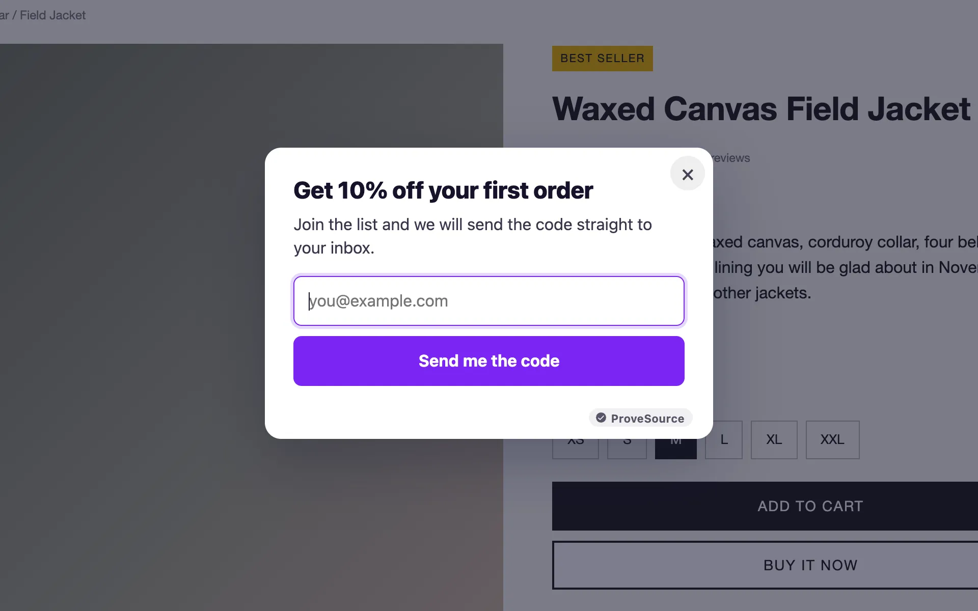
1. The first-order discount
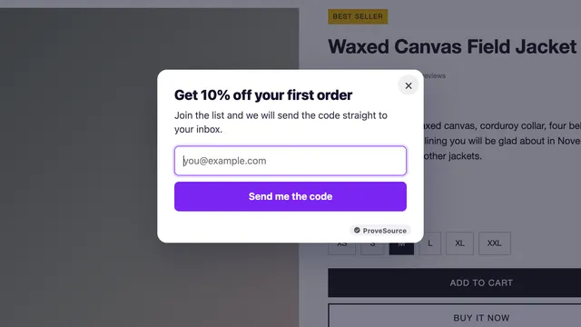
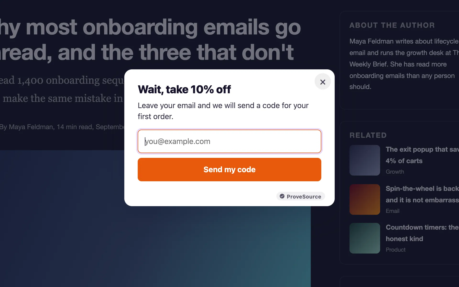
“Wait, take 10% off” with a single email field. The code appears on the screen as soon as they sign up. It works on stores where most first-time visitors leave without buying and a discount is already part of the pricing.
Settings: product pages (on Shopify, addresses containing /products/), new visitors only, once a week.
2. The cart reminder
“Your cart is saved, finish your order in one click” with a button to checkout, no email field at all. The visitor already decided what they want; the popup only has to point back to it.
Settings: the cart page only, by showing it on pages whose address contains /cart.
3. The content upgrade
On a blog post, offer the checklist or template version of the article: “Get this as a one-page checklist”. It converts better than a generic newsletter prompt because it is about the page they just read.
Settings: blog pages, once per visitor, never on the checkout.
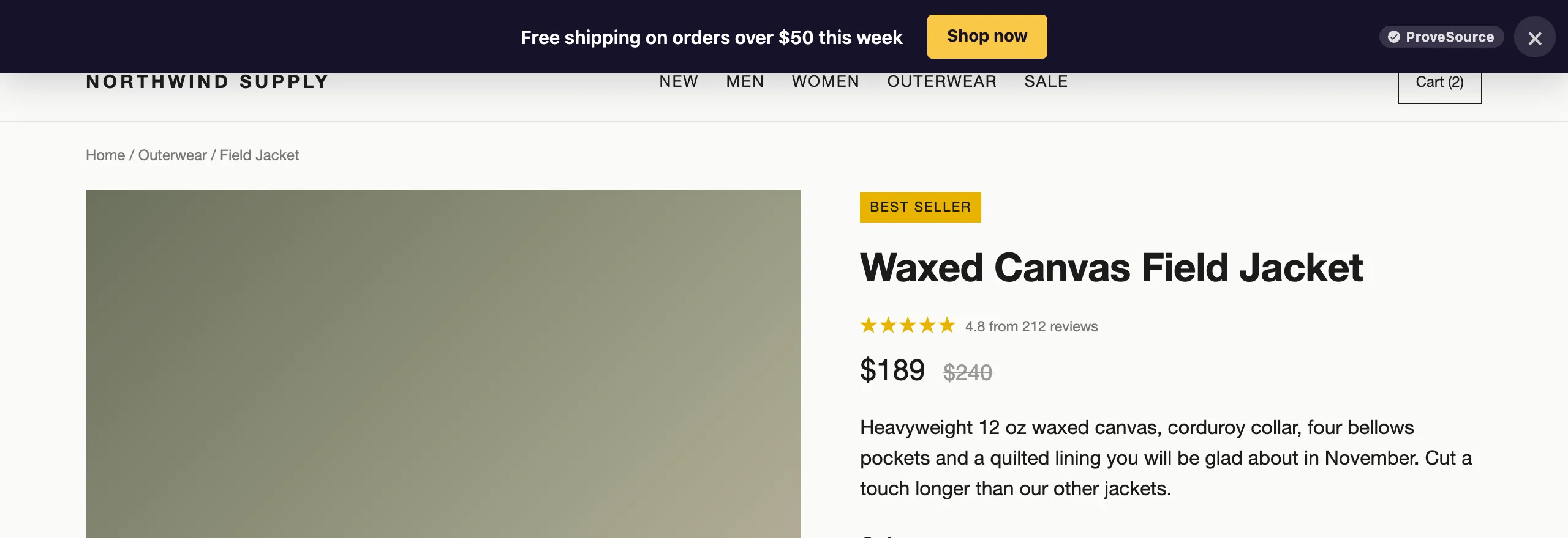
4. The free shipping nudge
If you offer free shipping above a threshold, say so on exit: “Free shipping on orders over $50”. It answers the most common reason for abandoning a cart before the visitor gets there. This one also works well as a bar that stays at the top of the page instead of a popup.
5. The newsletter with a reason
“One email a week with the three best deals” beats “Subscribe to our newsletter”. Say what they get and how often, then ask.
Settings: all pages except checkout, returning visitors, once a month.
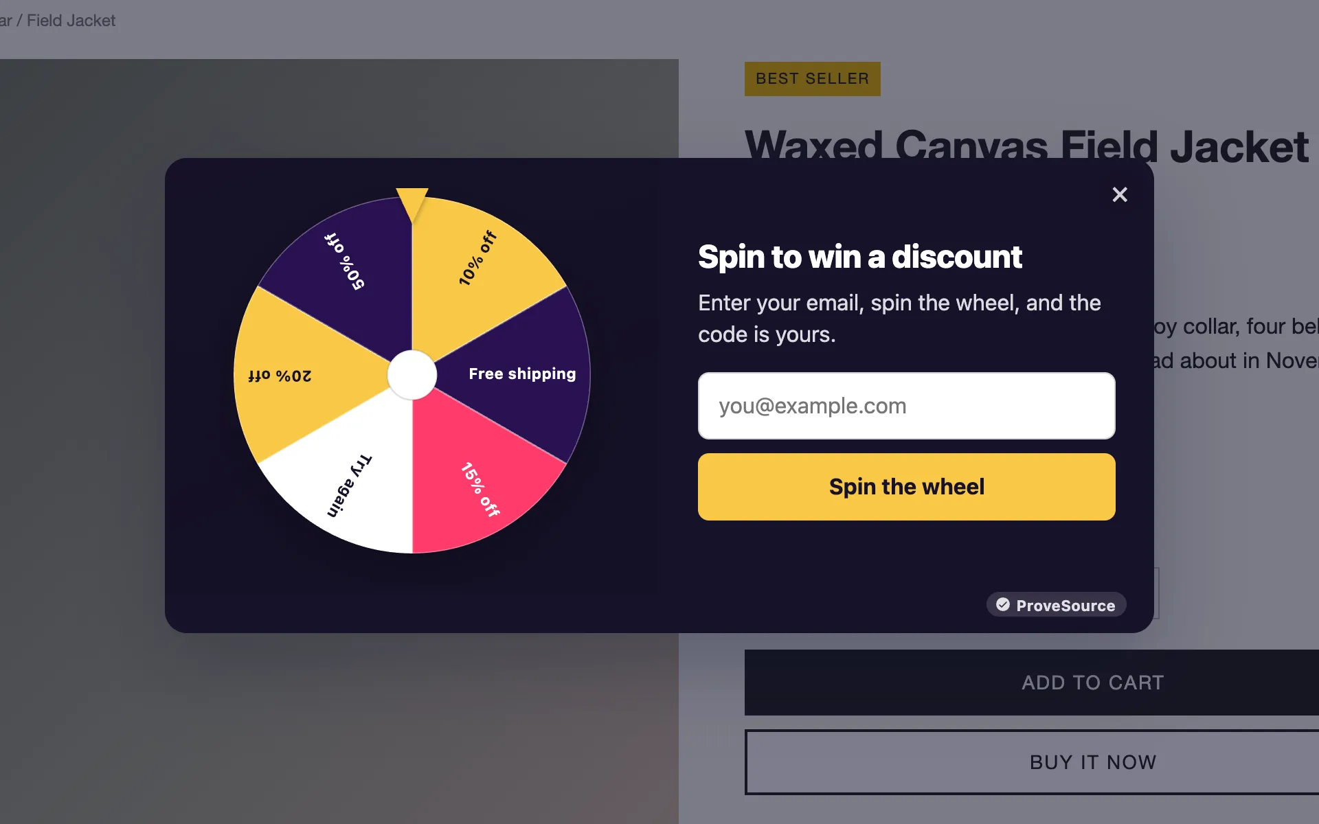
6. Spin to win on exit
A prize wheel turns the email ask into a game. It suits stores with frequent sales and a young audience, and it is worth setting the odds so that most spins win something small.
Settings: new visitors, once per visitor. Read more on the spin the wheel popup page.
7. The one-question survey
“What stopped you from buying today?” with four answers: price, shipping, not sure it fits, just looking. You get no email and no sale. You get the reason, from the people who are leaving, which is the one group you normally never hear from.
Settings: product pages, for two weeks, then turn it off and read the answers. A popup with one dropdown field does it, or describe it to the AI widget builder.
8. The deadline
If an offer really ends soon, a countdown in the exit popup is fair and useful: “The launch price ends Friday”. If the deadline is invented, visitors notice when it resets, and you lose more trust than the popup ever earns.
9. The question channel
For stores and services where people leave because they have a question, an exit popup can offer the answer instead of a discount: “Questions about sizing? Message us on WhatsApp”. A WhatsApp button in the corner does this all the time; the exit popup does it at the moment it matters.
10. The B2B guide
On a SaaS pricing page, offer the thing a buyer needs to convince their manager: a comparison sheet, a security overview or a case study. It turns a leaving visitor into a lead your sales team can follow up with.
Settings: pricing and features pages, desktop only.
How to add an exit-intent popup to your site
You can build one with the free popup generator without signing up first:
- Pick a template and write your offer. Change the colors to match your site.
- Open Display rules and set Show it to “When the visitor is about to leave”.
- Set Show again to someone who closed it to “After a week”, and narrow the pages if you need to.
- Enter your email to get your tag, then paste the one line into your site. Shopify, WordPress, Wix, Squarespace and Webflow all have a place for it.
On touch devices the same popup shows after 15 seconds on the page, so check how it looks on your phone before you call it done. If it covers too much of the screen, switch the layout to a corner card.
How to tell if it is working
Compare the popup’s views with its signups, not your site’s traffic with its signups. An exit popup only reaches people who were leaving, so its rate looks low next to a welcome popup that reaches everyone. The fair comparison is against the same visitors with no popup at all, which you can approximate by running it for two weeks and turning it off for two.
Watch one more number: how often people close it. If most visitors close it within a second, the offer is wrong or the popup is showing to people who were not leaving. Change the offer before you change the design.
Frequently asked questions
What is an exit-intent popup?
A popup that appears when a visitor looks like they are about to leave the page. On a desktop that means the cursor moving out through the top of the window, towards the tabs, the address bar or the close button. It is the last message a leaving visitor sees.
Does exit intent work on mobile?
Not in the same way. A phone has no cursor, so there is nothing to watch leave the window. Mobile tools use a substitute instead, usually a timer, a fast scroll back up, or a trick with the back button. The first two are reasonable; the back-button trick is not.
Do exit-intent popups hurt SEO?
Google’s guidance warns against interstitials that cover the whole page and block the content, especially on mobile. A desktop exit popup appears after the visitor has read the page, which is a different situation. On mobile, prefer a small card or a bar over a full-screen overlay.
How often should an exit popup show?
Once per visitor per week is a sensible start. Someone who closed it does not need to see it on every page, and someone who already signed up should never see it again.
Can I add an exit-intent popup for free?
Yes. ProveSource Boost’s free plan includes exit-intent triggers on every popup, with 3 widgets and 1,000 views a month.