Since officially launching ProveSource on May 2018, we have collected more than 23 million different data points from more than 3000 websites and online stores.
That’s a lot of social proof for 6 months.
After crunching thousands of notifications, engagements and analytics data, we have found several interesting patterns, and we decided to share them with you directly to increase your engagement, conversions and sales.
Here’s the short version what we have found and can be considered best practices for your social proof:
- Visitors click your notifications (average 4% CTR). Make them clickable and drive traffic to important pages.
- Design your notifications, use colors and contextual icons/gifs.
- Create at least one Stream notification.
- Show your notifications on mobile.
- Set your “Delay before first notification” to 0.
- Set your “Delay between notifications” to at least 4 seconds.
- Set your “Display each notification for” to at least 6 seconds.
- Keep your message short with no more than 12-15 words.
Here’s the long version:
1. Make your notifications clickable
By making your notifications clickable, you can drive more traffic to your relevant and important pages such as pricing, checkout, product info etc.
We’ve seen that new visitors tend to click on your ProveSource notifications at least once when there’s a CTA.
Our suggestion: turn on the “Clickable Notification” setting and add a custom CTA.
2. Use Your Own Icons & Colors
Yes, you can create your social proof notification in just 20 seconds, but it doesn’t mean it’s going to affect your conversions right away.
After comparing the default notifications design vs. custom icons/colors, we’ve noticed a huge impact on visitors’ engagements and attention. Pretty designed notifications CTR is around 10% compared to 1.5% for the defaults ones (Around 6x clicks).

Our suggestion: Try to match your notifications’ colors with your website’s theme and add a nice icon in the context of your notification. Gifs and animated icons work best!
3. Stream Notification Is the Most Popular
We weren’t surprised, what’s better than showing your visitors who else just did something on your website?
Pages with a Stream notification tend to get 4X more conversions than pages with a Page Visits notification and that’s a fact.

As long as you have events to show, it’s a no brainer for your website.
Our suggestion: Add at least one Stream notification that shows recent purchases, signups, etc to your home page, you’ll notice the difference.
4. Mobile Rules
84% of our customers who display their notifications on mobile as well, see a higher engagement rates.
Since the mobile screen real estate is limited, it’s more likely to grab the attention of a visitor.

Our suggestion: Notifications are shown on mobile by default, and we suggest not hiding them on mobile screens.
5. Do Not Delay Your First Notification
Social proof notifications are not like the regular intrusive popups.
They are part of your website. As soon as someone visits your website, attract their attention immediately and show them that they are not alone in the party.
2/3 of ProveSource customers who set the initial delay to 0, saw an average of 30% more engagements and conversions than others.

Our suggestion: Set your “Delay before first notification” to 0
6. Give Your Visitors Some Space
Visitors come to your website because they are interested in you, your product or service. They came to learn, read, collect information before they signup or purchase, and that’s why setting a delay between the appearance of your notifications is crucial – to keep your visitors focused and not distract them too much.
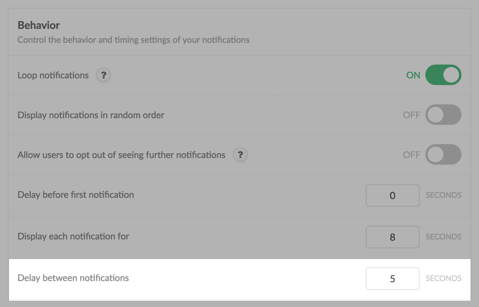
Our suggestion: Set your “Delay between notifications” to at least 5 seconds.
7. Give Your Visitors Enough Time to See Your Notifications
Most people are able to read 200 to 400 words per minute (wpm), i.e. around 4 words per second.
Now, let’s take a look at the average content length of a typical notification: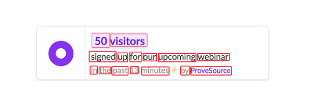
This notification contains 15 words, and an animated icon. It should take no less than 5 seconds to read the content of a notification, understand it’s meaning, process the icon, colors and produce an action.
That’s why we’ve seen that 71% of our customers who present their notifications for at least 7 seconds, get more engagements and conversions.

Our suggestion: Set your “Display each notification for” to at least 7 seconds.
8. Keep It Simple
As mentioned earlier, social proof notifications are not popups. Your should keep them straightforward with a clean, short and focused message.
Look at these two examples:

Well, you get the idea. And that’s why notifications with no more than 12-15 words performs 91%(!!!) better than long messages.
Our suggestion: keep your message short with no more than 12-15 words.
Now, go and make your changes 🙂