Let me tell you one of the biggest misconceptions in online business:
A lot of traffic on your website equals tons of revenue and conversions.
Don’t get me wrong, getting people to visit your website and landing pages is a great win. Yet, it means nothing if you can’t turn them into customers.
That’s why traffic generation is only half of the battle.
The landing pages are responsible for turning visitors into customers and winning that second part of the battle. But that’s where the real struggle happens. Only 2.35 percent of all landing page visits end up in conversions.
Why so few?
Many factors influence the ability of the landing page to convert visitors. The design is a critical one. Fixing your design to make it easier to convert is a must for winning more customers.
In this post, find five ways your current landing page design could be hurting conversions right now.
1. No Call to Action Above the Fold
Building a high-converting landing page can be a challenge.
There’s so much you might want to share with your potential customers: prices, features, customer testimonials, case studies, logos of client companies, and many other things.
You might need not one, but three pages to fit everything.
It’s so tempting to mention these things, so the CTA can easily end up at the very bottom of the page. As a result, the visitor doesn’t see it right away when they land on the page.
This is a huge mistake that hurts conversions.
The main purpose of the CTA is to draw the attention of the visitor to the action you’d like them to take. Placing it at the very bottom of the page reduces its ability to deliver on this goal.
How to Fix This Landing Page Mistake:
You must have an above-the-fold CTA. It immediately draws the attention of the visitors, which is a must for maximum conversions.
Look how Crello places a contrasting, compelling CTA that’s impossible to miss.
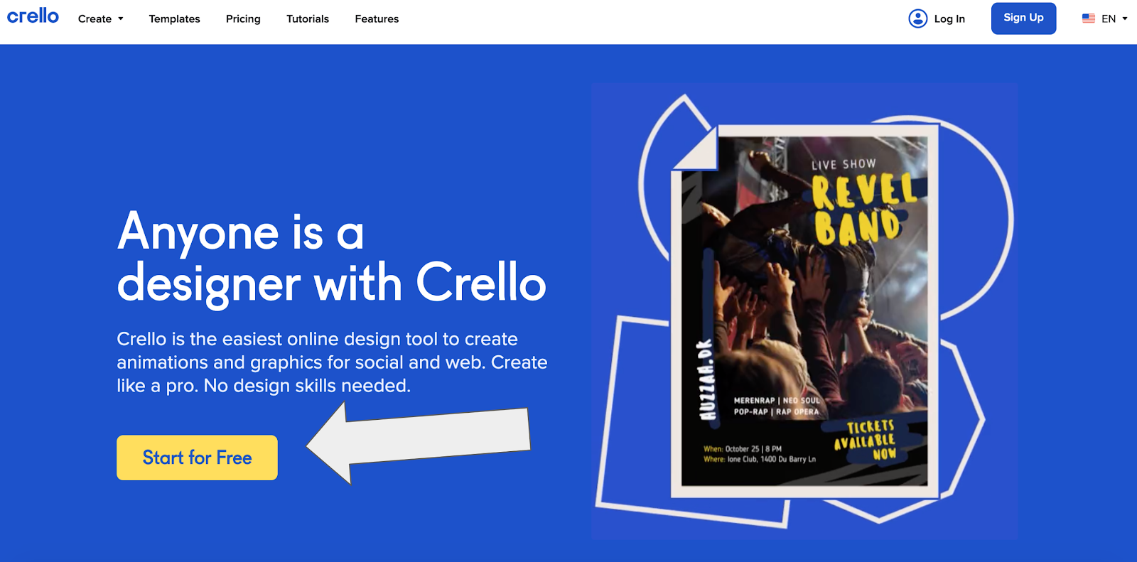
As you can see, the copy on this SaaS landing page is very short, too, to avoid causing additional distractions.
The copy mentions the most important benefits for visitors:
- What? “Easiest online design tool”
- For what? “Create animations and graphics”
- So what? “Create like a pro”
- Is it difficult? “No design skills necessary.”
The copy needs to be concise and convey these points, which are just enough to convince the reader to convert.
The visitor lands on the page, reads about the benefits, likes them, and BAM! They can immediately click on the button and start taking advantage of them. If the CTA wasn’t readily accessible, the chance that they would click it would be lower.
If you use a landing page builder or a template, ensure that the CTA is placed above the fold on all devices.
2. A Lack of Any Trust Indicators
For your customers, the fact that your product or offer is very good doesn’t mean a lot.
In fact, only 34 percent of customers trust brands they have even bought from.
Many prefer to purchase from trusted companies, so they often look for positive customer reviews and other trust indicators. A lack of those on your landing page means a lot of potential customers will go away.
That’s why you need to have trust indicators to establish trust with potential customers.
The common trust indicators are:
- customer testimonials
- user reviews
- client/partner logos
- industry accreditations
- product purchases.
How to Fix This Landing Page Mistake
Your landing page must have at least one kind of trust indicator to convert more visitors.
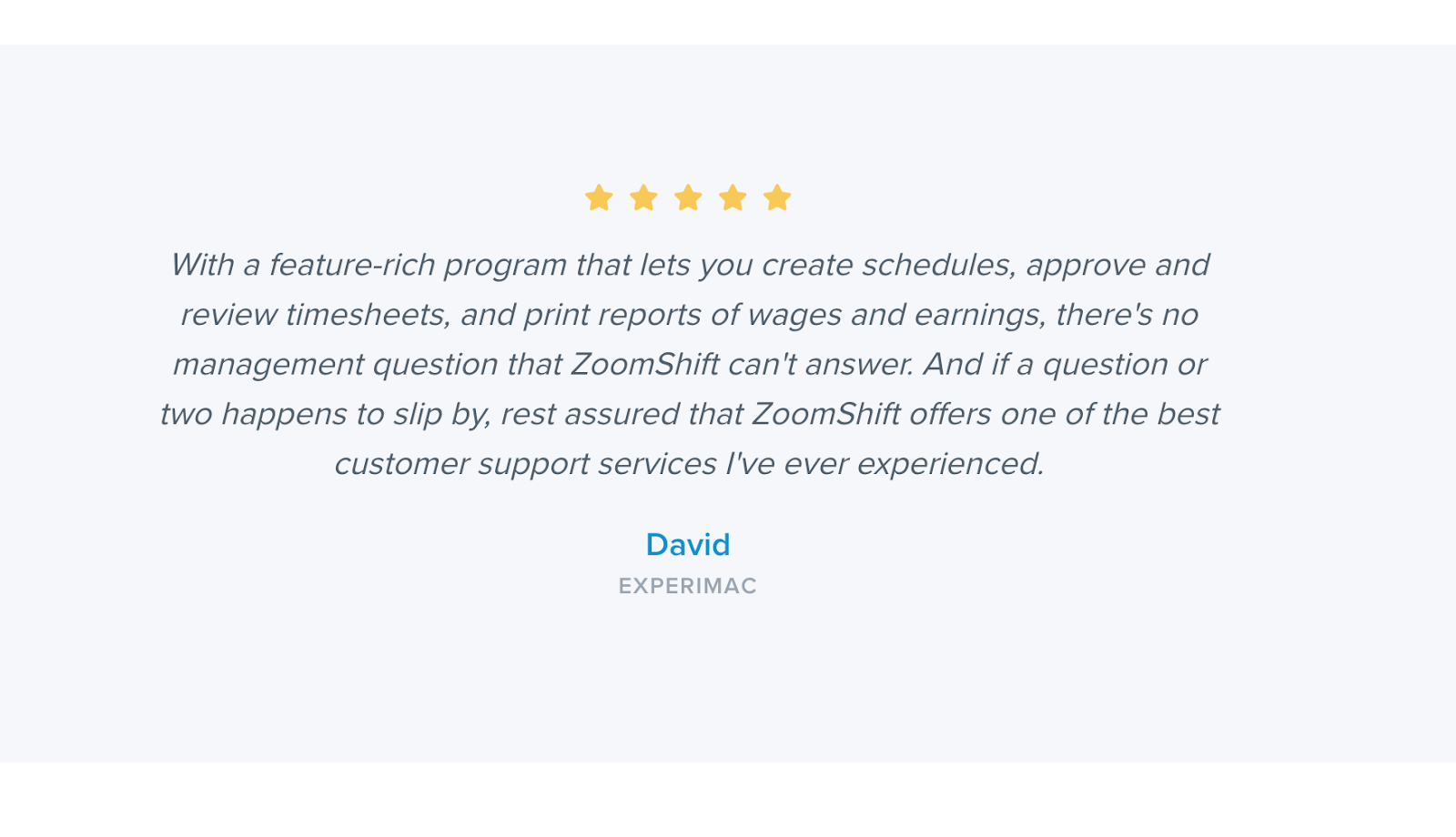
For example, you can include a customer review after the product features section. Here’s one example from ZoomShift that uses a review to promote its Timesheet app.
Also, try to include the name of the customer and the company they work in. This adds more credibility to the review.
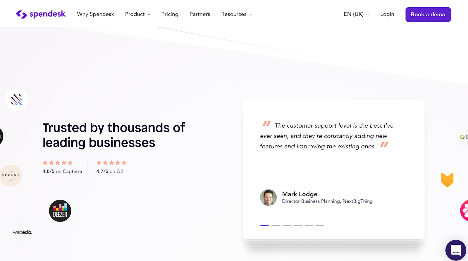
Spendesk does a great job by sharing more details about business customers. Each review they display at their landing pages has photos of customers, position in their companies, and names of their businesses.
On top of that, Spendesk also displays the ratings on popular review sites, which also adds to the credibility.
Another powerful way to deliver multiple trust indicators is to show push notifications. By adding the ProveSource widget to your website, for example, you can display notifications like these on the landing page.
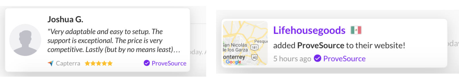
There are more important types of notifications to show:
- add-to-cart notifications, e.g. “Samantha just added our product to the cart”
- sign up notifications, “Jack just signed up for our email newsletter”
- product purchase notifications, e.g. “Mark just purchased our product”
- social media-related notifications, “1,000 new people followed us Instagram today.”
The notifications can also encourage visitors to convert into leads by signing up for a newsletter. If you don’t send out one, check these awesome newsletter ideas for inspiration.
But the best thing is that they show that your company has a good history and people trust you. This is huge for conversions!
3. The Design that Distracts from the CTA
The design of your landing page can be distracting from the CTA if it:
- has too many visual elements that minimize the white space
- has visuals containing many colors that “bury” the CTA in them
- has the same background color as the CTA which prevents it from standing out from the rest of the content.
All of these can result in the failure to focus the attention of visitors on the action. They’ll take a look around and leave.
How to Fix This Landing Page Mistake:
Ensure that the landing page design uses plenty of white space. This is a must to make the CTA more prominent and focus the attention of the visitors on it.
Here’s how Helpjuice does it. The landing page’s white space ensures that the CTA is as prominent as it can be.
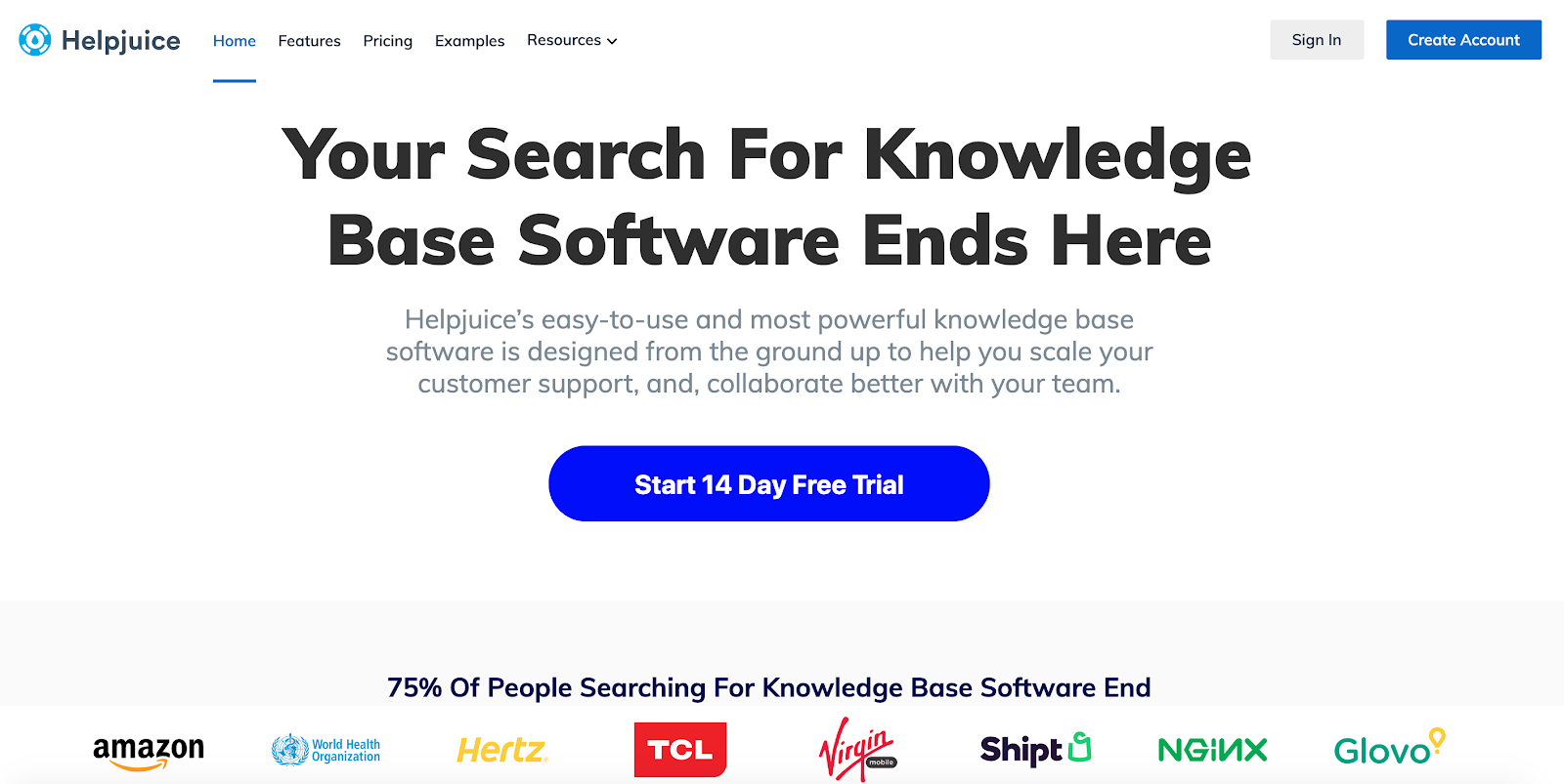
Pro Tip: test your page at different resolutions to see if the CTA is clearly visible on mobile devices.
Here’s how the HelpJuice’s landing page looks like on a smartphone screen.
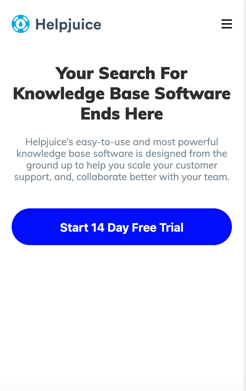
As you can see, the CTA is still prominently displayed, which means that the responsive website design remains non-distracting.
You can go with a minimalist design for your landing page – which is one of the biggest graphic design trends in 2020, by the way – because it reduces design elements. This makes it easier to create prominent CTAs.
4. Too Much Copy
Very early into the landing page creation process, you might realize that you have too many exciting ideas to share.
Yes, the same old stuff: prices, features, awards, customer testimonials, videos, FAQs, case studies, logos of client companies, and other things.
We get it. When you get a visitor on a landing page, you need to give them as much relevant information as possible.
But think about: if you do, you might end up with a landing page that has huge blocks of text. It can even look like something like this.
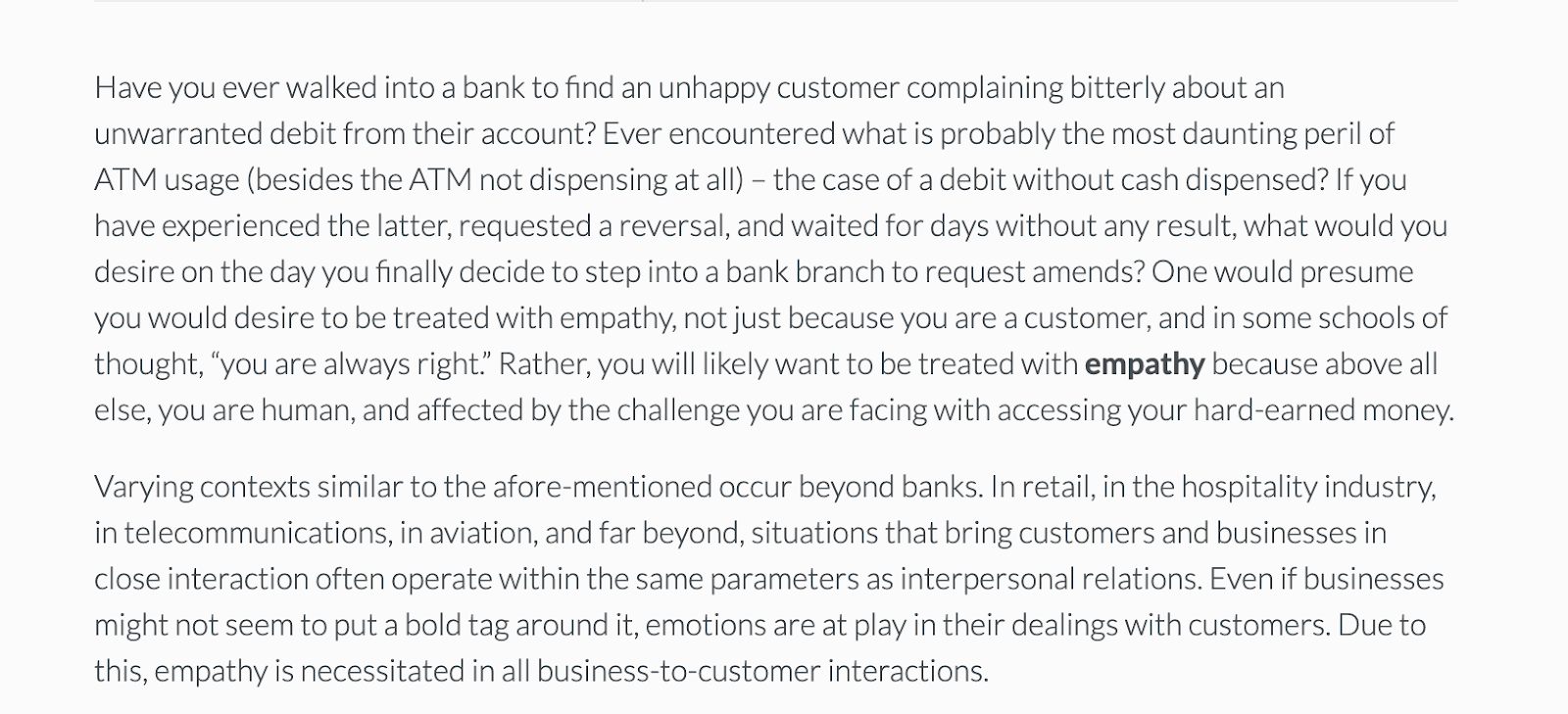
That’s a bit of an exaggeration, of course. Yet, it shows what too much copy can make your landing page extremely unappealing and dry as dust.
It’s not your personal essay, so most people simply won’t read it, and I don’t blame them one bit.
How to Fix This Landing Page Mistake:
There are two ways you can go about fixing this: writing a short copy and providing answers to FAQs with a chatbot.
First, you want to keep the copy concise, on-point, compelling, and clear.
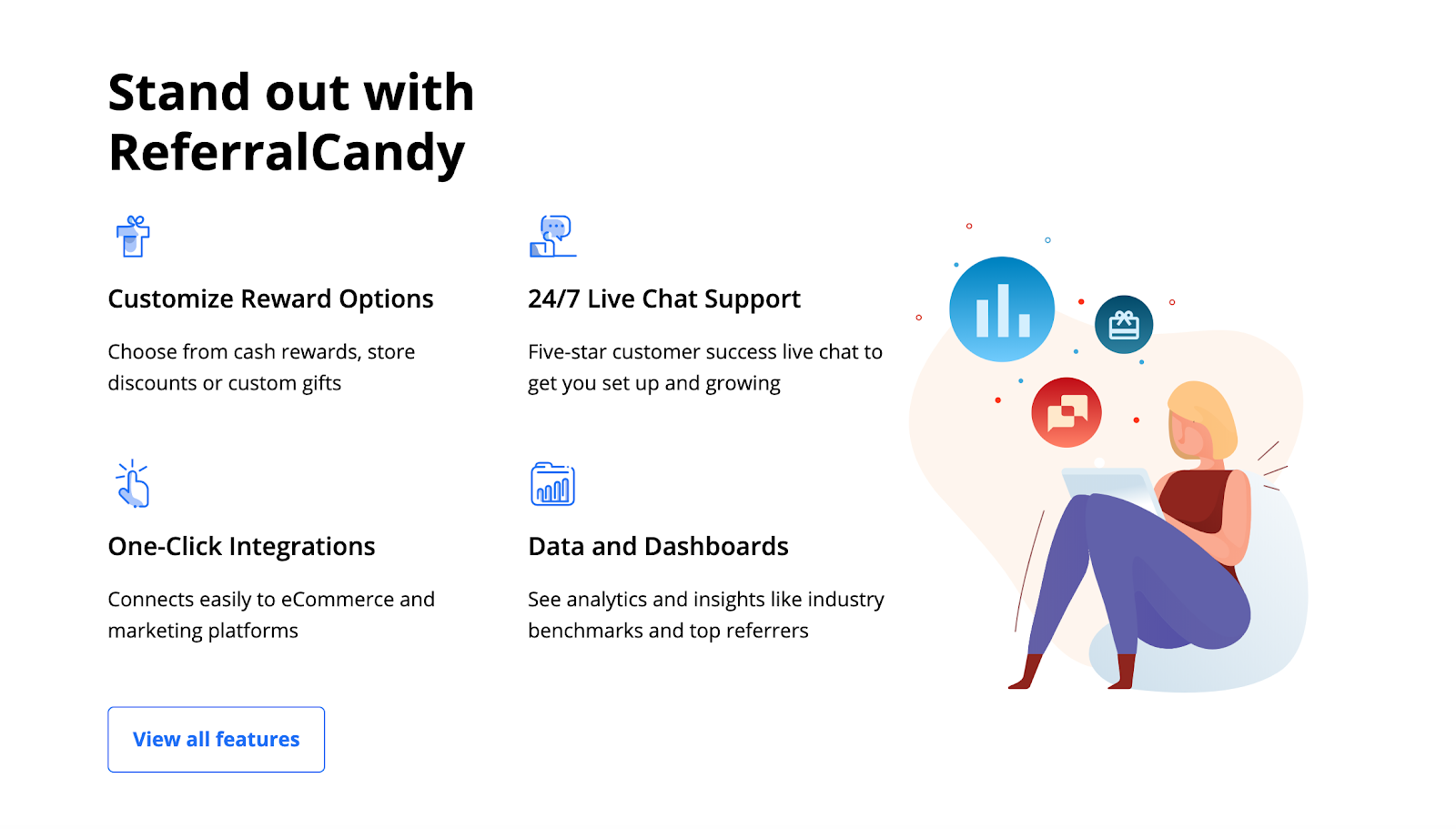
Like this landing page from ReferralCandy. It uses categories to present the copy, which is limited to one sentence for each section.
The copy describes what the users can do with the tool, which makes it more compelling for potential users.
Write the copy in a clear and concise language. It’s the best to ensure that the potential customer can quickly understand what you’re offering.
Also, you might want to add a product FAQ chatbot. This technique is called “conversational landing page” because the visitor basically has a conversation about the product with the chatbot.
Many visitors need to ask questions before making the decision to buy, so a chatbot is a good tool to provide answers and avoid cluttering up the page with text.
Here’s how a simple conversational landing page looks like, courtesy of Tidio.
Instead of using a sign up form or going to the product pages, the visitor can get almost immediate assistance from dedicated operators.
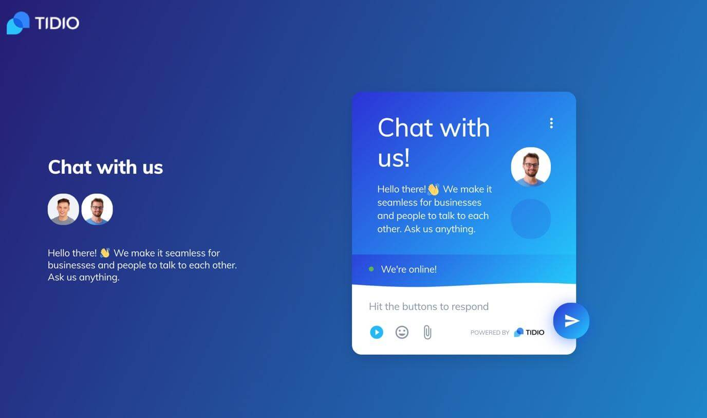
Those who get their answers fast will be more likely to convert, all thanks to the chatbot.
Using chatbots on landing pages in creative ways has been gaining popularity.
Pooch Bandana, for example, uses an awesome chatbot to offer assistance to customers visiting their product pages.
It’s personalized in a really amazing way that appeals to the target audience – dog owners.
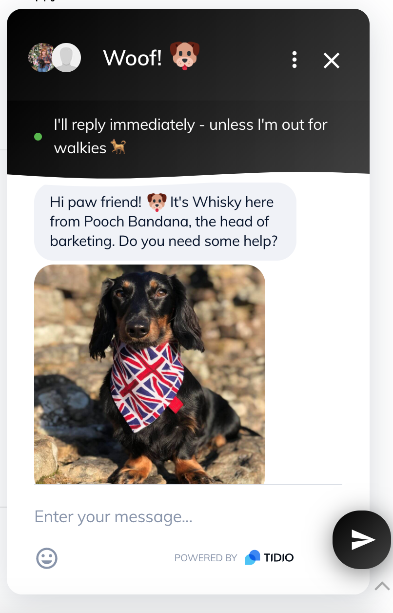
A chatbot like this should definitely attract the attention of dog owners browsing Pooch Bandana’s website.
Starting the conversation is really easy – the customer just needs to enter their message – which works well to reduce friction. Thanks to the chatbot, the brand can connect with potential customers whenever they would like to ask a question about a product.
This way, the business makes the visitor experience on a landing page a lot more engaging.
Creating a conversational landing page is easy. You can add a free chatbot app to both landing pages and product pages and, for example, customize it to resemble FAQs.
5. A Long Sign-up Form
Creating a high-converting landing page is all about minimizing friction and distractions.
A long sign-up form creates a lot of friction and makes it more difficult to convert, a landing page with it won’t convert that great.
Just imagine that you must enter your name, address, phone number, email, company name, number of employees, location, and many other details to sign up. Ridiculous, right?
That’s how many of your customers will think, too, if they see a long sign-up form on your website.
So, it’s not a good idea for lead generation.

How to Fix This Landing Page Mistake:
Minimize the number of fields to fill out to reduce friction. At that point, try collecting only the essential information such as the email and name.
Here’s how Automate.io does it.
Automate.io’s homepage, which is also a landing page, has a sign-up form with only three fields. Besides, there’s a registration through Gmail available, which allows you to sign up in a few clicks.
By making the sign-up so simple, you can also make it easier for your customers to convert. You can still request more information from them after the registration is done.
Vyper.ai goes one step further and reduces the number of fields in the sign-up form to one. To create a social media contest, the user just needs to type in the name of their brand.
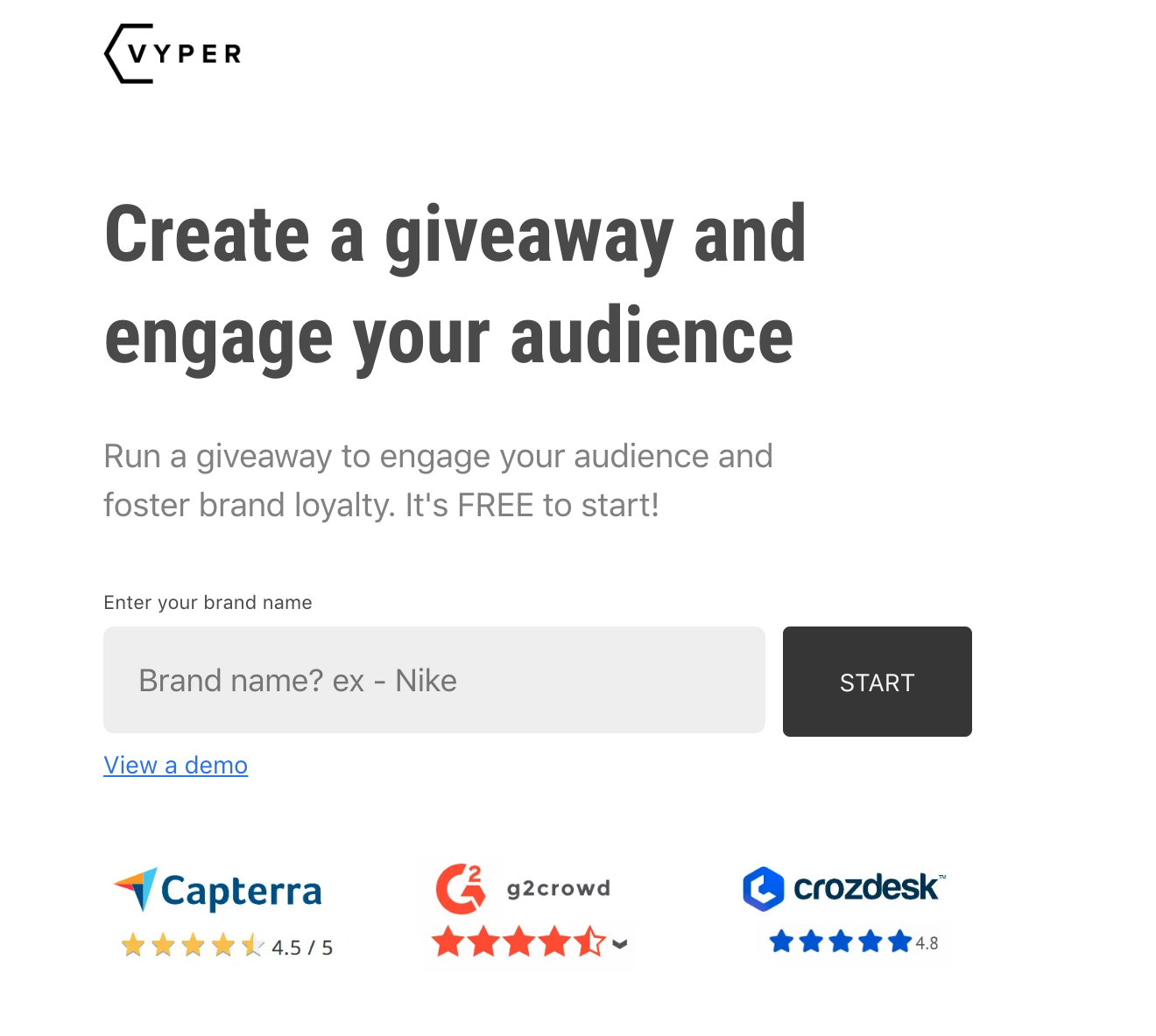
All other details are requested later, so making the first step to creating a custom social media contest is ridiculously easy.
So, to sum up: long and demanding sign-up forms on landing pages don’t work. You need a short form that makes it easy to convert or a chatbot to give customers the answers they need to make a decision.
Fix These Mistakes to Get More Conversions
There are many things that might be hurting the ability of your landing pages to convert traffic into customers.
The ones you’ve just read about are some of the most common ones, so check if they are a problem for your business.
Use the tips I’ve mentioned, and winning the second part of the battle for customers will become much easier.