How to Optimize Your E-Commerce Checkout Page for Better Conversions

Is your checkout page a conversion killer? It doesn’t have to be. Optimizing this crucial step can significantly boost sales and reduce cart abandonment.
Key Strategies:
- Simplify the Process: Fewer steps mean fewer drop-offs. Aim for a single-page checkout or clear progress indicators.
- Build Trust: Use security badges, offer multiple payment options, and provide clear return policies.
- Optimize for Mobile: Ensure a seamless experience on all devices.
- Offer Guest Checkout: Don’t force registration – give customers a quick checkout option.
- Provide Clear Information: Show order summaries, shipping costs, and delivery estimates upfront.
Tools to Help:
- Google Analytics: Track user behavior and identify drop-off points.
- Hotjar: Get insights into user interactions with heatmaps and session recordings.
- Shapo: Showcase customer testimonials to build trust.
Benefits:
- Increase Conversion Rates: By streamlining checkout, you’ll turn more browsers into buyers.
- Reduce Cart Abandonment: A smoother process means fewer shoppers leaving items behind.
- Improve Customer Satisfaction: A hassle-free checkout builds trust and encourages repeat purchases.
Looking for a complete, store-wide playbook? Grab our Shopify Conversion Handbook for benchmarks, page-level optimizations, and a 30-day testing roadmap that amplifies every checkout tweak you make.
Let’s dive into actionable steps to transform your checkout page from a bottleneck into a conversion engine.
Make the Checkout Page Experience Faster
Customers abandoning carts can cost a lot of lost revenue. Statistics from the Baymard Institute reveal that the average cart abandonment rate is nearly 70%, with a complicated checkout process being a primary cause. To make your e-commerce checkout process faster and easier, focus on these key elements:
Streamline the Number of Steps
Aim to reduce the number of steps in the checkout process. Simplify it down to as few steps as possible without compromising security or necessary information gathering.
One-page checkouts are a great option for consolidating everything onto a single screen. However, if that’s not possible, use progress indicators to help customers know where they are in the checkout process and how much longer it will take to complete.
Implement Guest Checkout Options
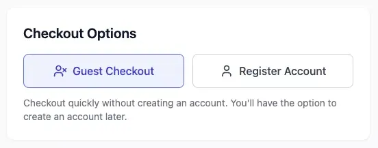
Forcing users to create an account before they can purchase is a huge turn-off. According to Baymard, offering guest checkout options can boost conversion rates by up to 45%.
Tools like Shopify and BigCommerce make it easy to offer guest checkout options and can automatically send account creation invitations once the purchase is complete.
Optimize for Mobile Devices
Mobile devices now account for a significant percentage of online sales, making it vital that your checkout process works seamlessly on smartphones and tablets. Responsive design and fast loading times are essential.
“70% of online shopping carts are abandoned. Checkout optimization is a major key to reducing that number. It’s about turning casual browsers into loyal customers.”
Make sure all form fields are easy to fill out on smaller screens. Reduce the amount of typing required by using tools like address auto-complete and payment autofill. Streamlining the process for mobile users ensures a smooth experience.
A fast and user-friendly checkout process not only improves conversions but also enhances overall customer satisfaction. Up next, we’ll explore ways to build trust and address security concerns on your checkout page.
Building Trust on Your Checkout Page
Customers are more likely to complete a purchase when they feel their data is secure and the transaction is reliable. Building trust on your e-commerce checkout page is a crucial step to boost conversions and reduce cart abandonment.
Display Security Badges and SSL Certificates
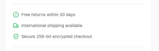
Clearly showcase security badges and SSL certificates to assure customers that their personal and payment information is protected. Displaying trusted symbols like those from Norton, McAfee, or PayPal can greatly increase confidence.
SSL certificates ensure that the connection between the customer’s browser and your website is encrypted, protecting sensitive data like credit card numbers and addresses.
Offer Multiple Payment Options
Catering to various payment preferences is essential for increasing conversions. Offer popular choices like:
- Credit and debit cards
- Digital wallets (PayPal, Apple Pay, Google Pay)
- Buy Now, Pay Later (BNPL) services (Klarna, Afterpay)
Make sure each payment option is clearly presented with its logo and a brief description of how it works. Adding trust badges next to each payment option can further boost confidence.
Provide a Clear and Concise Return Policy
A clear and easy-to-understand return policy can alleviate customer concerns and encourage them to complete their purchase. Make your return policy easily accessible on the checkout page, preferably with a direct link from the order summary. Highlight key points such as the return window, return shipping options, and any conditions or exclusions.
“By displaying security badges, offering multiple payment options, and providing a clear return policy, you signal to customers that their security and satisfaction are top priorities.”
Building trust not only increases immediate conversions but also fosters long-term customer loyalty. Next, we’ll examine how to present clear and accessible information on your checkout page.
How to Present Clear and Accessible Information
Clear and accessible information is crucial for creating a seamless and trustworthy checkout experience. Lack of clarity can lead to customer frustration, cart abandonment, and lost sales. Here’s how to make sure your customers have all the information they need at their fingertips:
Show an Order Summary Before Checkout
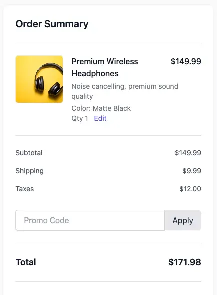
A clear order summary can significantly reduce cart abandonment rates. This summary should include:
- A list of items in the cart
- Quantities for each item
- The price of each item
- Any applicable discounts
- Total cost, including taxes and shipping fees
If possible, allow customers to easily modify their order directly from the summary. Make sure the option to remove items is clearly visible, and provide a way to update quantities if needed.
Make Shipping Costs Transparent
Hidden shipping costs are a leading cause of cart abandonment. Be upfront about shipping fees and delivery estimates early in the checkout process.
- Display estimated shipping costs on the product page or in the cart.
- Offer a variety of shipping options to accommodate different budgets and timelines.
- Provide a clear delivery estimate on the checkout page.
Consider offering free shipping when customers reach a certain spending threshold. This can incentivize them to add more items to their cart.
Provide Easy Access to Support
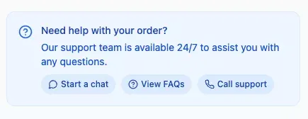
Customers should be able to get help quickly if they run into any issues during checkout. Provide easy access to customer support through:
- A live chat feature that allows immediate assistance.
- Links to an FAQ page that addresses common questions.
- Contact information for phone or email support.
- An accessible search bar to help them find relevant information on your website.
Quick access to support ensures that any concerns or questions can be addressed promptly.
Tools to Collect Customer Testimonials
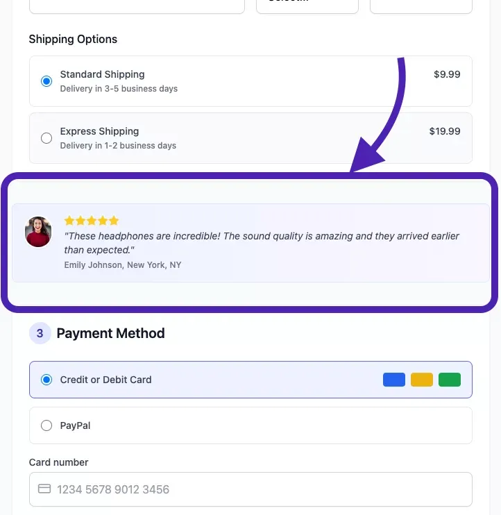
Adding social proof to your checkout page can significantly increase conversions. Seeing positive reviews and testimonials from other customers can provide that extra bit of reassurance needed to finalize a purchase.
Shapo: A Testimonial Management Platform
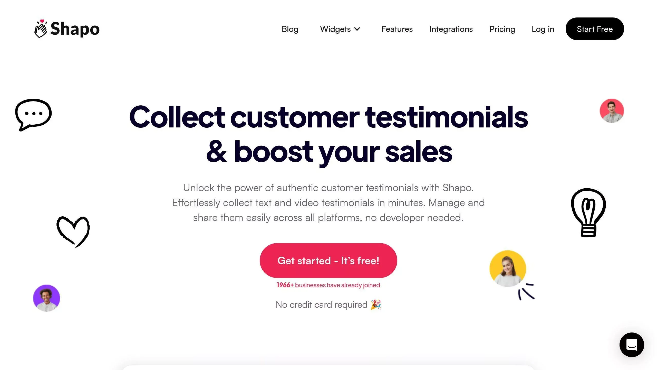
Shapo helps manage and display testimonials by pulling reviews from over 20 different platforms, and by supporting video testimonials.
Here’s a quick breakdown of what it offers:
- Customizable Review Widgets: Use offline testimonials with designs that match your brand.
- Organize the Reviews: Pull from over 20 different platforms.
- Wall of Love: Display all reviews in one place.
Best Way to Collect Customer Testimonials
Use post-purchase follow up emails. Set up automated follow-up emails sent a few days after a customer receives their order. Keep the feedback process simple, asking for a brief review of the product and their overall experience. Consider offering an incentive, such as a discount on their next purchase, to encourage participation.
Incorporate elements of personalization, create testimonials that focus on what makes their purchases unique, and be clear about the kind of feedback you are seeking. Doing this not only enhances credibility but also maximizes customer trust.
In conclusion, by displaying order summaries, shipping costs, and providing support, your potential customers are more likely to complete purchases.
Monitoring and Testing Your Checkout Performance
Once you’ve optimized your checkout process, it’s important to continuously monitor its performance and make adjustments as needed. Analytics tools provide valuable insights into user behavior, helping you identify areas for further improvement.
Google Analytics and E-Commerce Tracking
Google Analytics is a powerful tool for tracking user behavior on your checkout page. With Enhanced Ecommerce Tracking, you can gain insights into:
- Checkout Behavior: Analyze drop-off rates at each step of the checkout process.
- Product Performance: See which products are most frequently abandoned in carts.
- Affiliate Behavior: Evaluate conversion rates based on what affiliate link or promotion they clicked.
- Traffic Sources: Identify the most valuable sources of traffic for your website.
To set up Enhanced Ecommerce Tracking, you will need to add tracking code to your website and configure the settings in Google Analytics.
Heatmaps and Session Recordings of your checkout page with Hotjar
Heatmaps and session recordings provide a visual understanding of how users interact with your checkout page. Tools like Hotjar can help you identify areas where users are getting stuck or confused.
By analyzing this visual data, you can make informed decisions about how to optimize the design and layout of your checkout page.
Conduct A/B Testing on Key Elements
A/B testing is a powerful way to test different variations of your checkout page and identify which elements are most effective at increasing conversions. Test elements of the checkout experience, including:
- Button Text and Placement
- Form Field Order
- Payment Options
- Headline copy
- Security badges
Use tools like Optimizely or VWO to easily set up and run A/B tests on your checkout page.
By continuously monitoring, testing, and optimizing your checkout page, you can ensure it is functioning as effectively as possible.
Don’t Forget Your Mobile Testing
Don’t forget mobile devices! Many testing tools allow you to filter results and test on specific devices so that you can catch any device-specific bugs.
Conclusion
A well-optimized checkout page is essential for e-commerce success. By simplifying the process, building trust, providing clear information, and continuously monitoring performance, you can reduce cart abandonment rates, boost conversions, and improve customer satisfaction. Implementing the strategies and tools, you can transform your checkout from a bottleneck into a conversion engine. To help you make the most of your checkout page, check out our 5 point checklist to improve conversions.
FAQs
How long should an e-commerce checkout process take?
For most e-commerce websites, three minutes or less is optimal. Any longer, and it may cause customers to abandon their purchase and increase the chances of customer disappointment.
What are the key elements of a successful checkout page design?
A successful checkout page design has clear call-to-action buttons, is free of clutter, and uses consistent branding across the payment gateway to make people feel at ease. Also, security badges and a transparent return policy are a must.