Business owners need to increase their conversion rates in different environments. Entrepreneurs usually focus on their core business tasks and try to attract more new clients that way. It’s important not to underestimate the potential of online conversions. If you spread the word about your business on the Web, you’ll raise more interest in your services. This is where website design comes on stage. With this in mind, here’s how to improve conversion rates with proper web design.
Increasing usability with whitespace
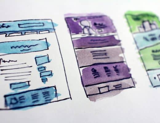
Business websites come in all forms and shapes. There are so many options that business owners might get confused with all these features. A rule of thumb for business websites is to be user-friendly and practical. White space is an important element for achieving this goal. If you pack your business website with excessive visuals, it will lower your conversions. Business users want to get the wanted information quickly and ask for the service they need. That’s why business owners need to ensure clear visibility of all the major information on their websites.
Branding via faces
Let’s face it, looking generic on the Web today is a one-way ticket to failure. Business owners who have generic websites and provide the same services, just like thousands of others can’t expect too much. But entrepreneurs who personalize their online presence are more likely to increase their conversions. So, you should add some storytelling features to your website, together with some authentic photos. Those images can be from different stages of your career.
Also, make sure to upload some pictures of your key staff members, along with their positions and achievements. Finally, promote the faces of your business on social networks, as well. The more personal brands you have, the more likely you are to increase your conversions. Users appreciate this personalized approach. It will increase their trust in your business.
Winning them over in a jiffy – 8 seconds
Every new generation of Internet users has a shorter attention span. This trend is more than obvious with Millennials and Generation Z but middle-aged audiences have less patience than before. Some recently published studies claim that we can wait up to 8 seconds when visiting a website. This means that website owners need to grasp their attention within this period. That’s why it’s recommended to cut to the chase, without too many unnecessary elements on the website.
Your homepage and landing pages need to contain only the essential information about your job, services, and the products you sell. Also, it’s good to have a crafty copywriter who will put these bits together in an amusing and original way. As for more detailed explanations about your business and its development, you have the About Us section and your blog posts.
Applying the rule of thirds
It’s easier for the human eye to perceive and process properly organized visual information. Therefore, business owners and their design collaborators need to bear in mind the rule of thirds. This rule implies that our eyes easily notice visual data organized in thirds. So, you should divide the pictures and other visual elements on your websites into horizontal and vertical thirds. The crucial information, such as the subscription button or purchase icon, should be presented at the intersections of these lines.
Business owners should incorporate innovative design features to create a new business reality, teaches this master’s degree in design management. The rule of thirds is one of these strategies that keep pushing the envelope and ensure higher revenues for contemporary companies.
Avoiding unnecessary complexity
Simplicity is one of the key prerequisites for higher conversions. When we think about the 8-second rule and the thirds-principle, it’s clear that website owners don’t have too much time. This refers both to their online conversions and their business success. If we know that about 20% of small businesses don’t make it to the second year, saying that time is money for SMB-owners isn’t an exaggeration.
Business websites need a simple and sleek design that will easily communicate the business message. Highlighted benefits for users, easily noticeable prices, and straightforward organization are only some of the desirable solutions, simplicity-wise.
Respecting visitors’ time
Many business owners upload explainer videos to their websites. Others prepare promotional presentations to attract new audiences. Some entrepreneurs publish various infographics to present their business results of the current affairs of the industry. These are innovative and attention-seizing ways of increasing website conversions. But none of these methods will work if you don’t respect your visitors’ time. Make sure that you create user-friendly content that doesn’t take too much of their time.
If you post concise but informative materials on your website, you’ll show that you appreciate your visitors’ time. What’s more, they’ll notice your wish to provide them with useful and relevant information.
Limiting the options
In some niches, like eCommerce, more is just more. However, for company and SMB-websites, less is often more. In other words, visitors will get confused if they face too many options on a business website. That’s why we’ve pointed out that you should highlight the main benefits for your customers and your prices. These are the two most important things for your visitors. If you place too many different things on your homepage, visitors won’t know what to look for. Eventually, they’ll leave the website, leading to a high bounce rate.
Website design is extremely important for business owners of all niches. You need to keep it simple and visually straightforward but still be authentic. When you cut a long story short and tell your visitors how they can benefit from using your services, you’re already on a path to success. Our tips should help you reach these goals and increase your conversion rates.